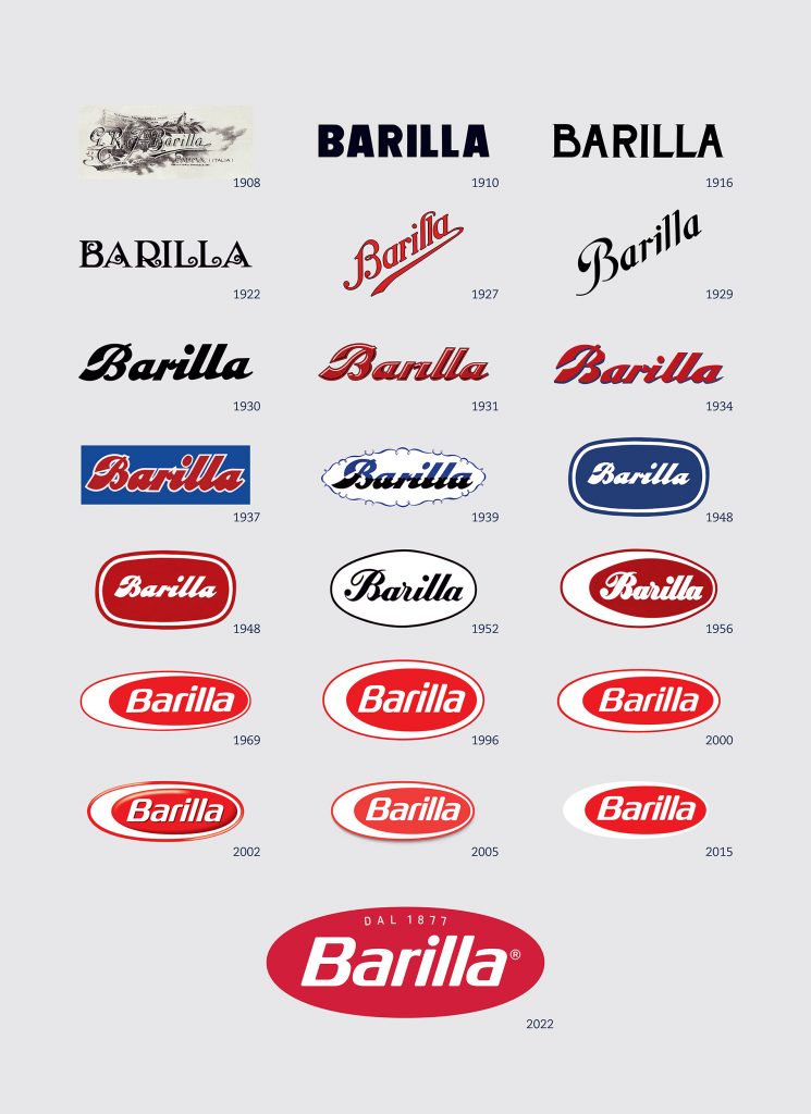
The history of the Barilla logo
Starting from an Egg: the history of the Barilla logo
Patrizia Musso – Andrea Semprini
The history of the Barilla logo
The logo, from poor Cinderella to protagonist of a story
In today’s social and economic context of omnipresent communication, the importance of the logo for a brand might seem as an obvious fact. None of the contemporary brands would think of neglecting such an important element in its advertising arsenal. On the contrary, even when corporate resources are scarce, the creation of a logo and of a visual identity for the brand are investments that only rarely are omitted. But it was not always like that. We can say that for a very long time, up to until about fifteen years ago, the logo was considered a secondary element, verging on the border with mere decoration. Essentially, out of all the various ways in which a brand could be represented, energy and resources were funnelled into advertising campaigns.
However, the situation gradually changed and today there is consensus on the importance of the other forms of expression of a brand, first and foremost its logo and visual identity. How can we explain this change in perspectives?
There are at least five important factors to help to explain this evolution and these deserve to be briefly mentioned. The first concerns the ‘crises’ of traditional advertising communication. The growing costs of mass advertising, the overcrowding of broadcast commercials, and the increased element of fragmentation of tastes and lifestyles across the population make traditional advertising increasingly expensive and proportionally less effective, in particular that which is broadcast on television. This crises of the credibility and of the legitimate scope of publicity has encouraged other forms of communication, among which the use of a logo, to emerge from the corner in which they were relegated.
A second factor concerns the greater attention that today is paid to the continuity of a brand, and not just its novelty or element of innovation. Traditional advertising tends to place greater value on impact; it tries to catch the attention of the public and therefore always needs to be original and innovative. These aspects are still as important as ever in the definition of brand strategies, but they are progressively supported by a greater awareness of the values that characterize a brand – like its roots, origins and history – and that allow it to endure the test of time. Though it is subject to a process of evolution like all other expressions of the brand, the logo is an element that tends to manifest a greater stability through time, and when it evolves, it tends to do so in a progressive and sometimes even almost imperceptible way. Therefore, the desire to stress the continuity of a brand has a faithful ally in the logo.
A third factor can be identified in the growing concern of brands to establish a strong and constant relationship with the public. Commercial advertising is unable to achieve this satisfactorily. Unless very large investments are made, advertising is only present for short periods in the context of a broadcast message. Its presence is intense but short, whereas the logic of relationships presupposes a less intense but constant presence. The logo, of course, is right at home in this sort of relationship. Its presence is unquestionably more discreet, but infinitely more systematic and long-lasting than that of large advertising campaigns; these have a greater impact on the public consciousness but do not feed the relationship between the brand and the public on a daily basis.
A fourth factor is the growing importance given to the visual dimension and to the aesthetics of a brand. The universe of a brand is relatively abstract. It is made of identity, values, strategies, concepts, meanings and emotions. All these aspects only become concrete for the public when they are embodied visually and perceptibly by a brand. The visual dimension is certainly not the only way in which the values of a brand are shown in a concrete manner. The feel of a material, the sound of an engine, the aroma of a biscuit, or the flavour of a sauce are equally expressive of a brand’s values. However, the visual aspect remains dominant and above all it makes it possible to communicate subtleties of meaning that are more difficult to convey using the other senses. As a key element in the visual identity of a brand, the logo allows basic brand values to be translated into a set of colours, lines and relatively abstract geometric shapes.
The fifth and final factor can be considered a synthesis of the first four, because it concerns the awareness of the company management of the importance of a brand in the development of corporate strategies. As we have seen, branding is an abstract phenomenon, a means of conveying meanings and promises that are more attractive and distinctive than those of competing brands. The logo allows these values, meanings and promises to be condensed and expressed in the wink of an eye. It works on the base of the semiotic principle of metonymy, according to which a part can express the whole synthetically and consequently more economically. It is a synthesis, a ‘condensate of perception’, because in a few traits it can summarize the philosophy and historical heritage of the brand, its values and its commitment to its public. Thus, once the Gestalt of the logo has been memorized, it just takes a moment for it to be perceived and for it to emanate its meaning: the identification of a brand and the metonymic recall of the totality of its significance and identity occur practically at the same time.
The recognition of a logo engages our perceptive faculties that partly bypass our intellectual reflection. A logo is rarely read or interpreted; rather it is recognized and understood. It communicates directly, without need to rationalize or justify what it represents, and it says much more about the brand than it actually shows, according to the principle of economy outlined above. The logo therefore represents a privileged access way to the identity of a brand, a small visual door that ushers us immediately into the world of the brand’s values. Jean-Marie Flochl observed: “Visual identity represents difference, in the sense that it ensures the recognition and successful outcome of the company, and that it expresses the company’s specificity. On the other hand, visual identity also represents permanence inasmuch that it accounts for the lasting over time of the industrial, economic and social values of a company. The persistence of company values should not be thought of in this case as simply repetition, but as a future with its own logic and directed progression.”
1 FLOCH Jean-Marie, Identità visive. Costruire l’identità a partire dai segni (Visual Identities. Building an identità starting from signs). Milan, Franco Angeli, 1997, p. 60.
The logo – a crossroad of meanings
This rapid overview of the evolution of the concept of brand and its social and economic context makes it easier to understand why today logos are given much more attention than in the past. Let us consider some characteristics of the function of a logo, and this will allow us to introduce the topic of the analyses of the Barilla logo.
In the previous paragraph it was emphasized how persistence is the fundamental trait of a logo, the fact that it is not subjected to continuous innovation and novelty as occurs for other manifestations of a brand, such as products and advertising. Logos evolve too, of course, and the history of the Barilla logo is an evident example of this fact. But their development is usually diluted in time, often over a span of decades, and in most cases the modifications are made in a gradual process that does not alter the essential features defining the identity of the logo and that make it easier to recognize it. There are logos that have remained almost identical for more than fifty years, as for example those of Shell, Michelin and Kodak. The main reason for this stability is the nature of the logo as a prototype and its role as a stable reference within field – that of brands – dominated by change. From this point of view, the logo is situated closer to a brand’s fundamental values, its essential elements in which the identity of the brand itself is safeguarded.
This proximity to a brand’s profound identity allows us to understand the multiplicity of the forms of communication strategies of a logo, its ability to address different public, among which that of the company itself. We can schematize the semiotic functions of a logo (or the way it constructs and communicates its meanings) in four directions: towards the various targeted public of the logo; towards the context external to the brand; towards the internal context of the brand; and towards the company’s history and culture. These four important areas of significance can be broken down into a number of sub-areas, but we will restrict ourselves to those most pertinent to understand the Barilla logo.
– The target public. The public is essentially made of consumers of the brand. The logo conveys consumer values (for example, the ‘goodness’ suggested by the Danone group) and evokes the functional or symbolic benefits linked to the use of a brand (freedom, in the case of the Motorola logo, or the untamed energy of the Ferrari logo). In the case of Barilla, a leading brand with strong penetration in a fundamental market like that of pasta, the notion of the consumer overlaps almost exactly with that of the target public.
– The context external to the brand. This refers to the socio-economic, socio-cultural and aesthetic context in which the brand is immersed and on which its conception and meaning depend. On this, the interpretation that is evoked by that meaning is based as well. We will see for example that the evolution of the Barilla logo, particularly in the period between the two World Wars, was strongly linked to the aesthetic and graphical styles fashionable at the time.
– The internal context of the brand. This primarily relates to the products advertised by the brand, in the case of Barilla, durum wheat pasta and to a lesser extent egg pasta. A logo can communicate a specific quality of a product (the light blue of the Danone logo is linked to milk), a characteristic of the production process (the light blue of the Gelati Motta ice-cream logo recalls the idea of cold), a specific skill (the Art Deco universe in the logo of Antica Gelateria del Corso (ice-cream) evokes the almost hand made quality of the product).
– The history and culture of the company. In this case the logo gives indications about the identity of the company itself that can be expressed by a familiar name, as in the case of Barilla, both by evoking the values the company represents or by referring to the components of the company, such as human resources, production equipment, or particular skills. Obviously, each logo presents a more or less complete mixture of these factors.
There are logos that emphasize only one of these dimensions while others refer to several aspects simultaneously. The latter are often more interesting in that they fully utilize the capability of figurative art to communicate several meanings at the same time (polysemy). If we add to these aspects the historic element which enables us to follow the evolution of a logo over several decades – in the case of Barilla over more than a century – we find ourselves in the presence of a dynamic subject of analyses that offers a large number of references to the economic, social, aesthetic and industrial situation off Italy through the past century. The analyses of a logo according to the principles of socio-semiotics allow us to reconstruct a fragment of the industrial history of a company and of the cultural history of the nation. The Barilla Historical Archive contains a large number of logos that were continually renewed particularly in the period between the two World Wars.
For reasons of simplicity and clarity, we suggest to group this collection into three important phases: the Putén phase (the significance of this Parmesan dialect term, which literally means ‘child’, will be explained), the signature phase and the phase of oval shape which is still in use today.
The putén phase (1910-1936)
Picture 1 – Barilla logo 1908
Picture 2 – Shop boy sell
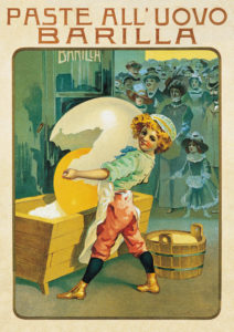
Picture 2 – Shop boy New Company Logo
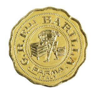
Although Barilla started trading in 1877 and although letterhead paper was used and documented in the early 1900s, (picture n.1), the first logo appeared in 19102. Production and distribution of Barilla products had grown considerably and in that year a pasta production factory, with a production capacity of 8000 kilograms a day, was opened outside the walls of the historical centre of Parma. Unsurprisingly, it was at that moment that Barilla felt the need to create a figurative symbol of its identity. The figure (picture n.2) used a style typical of illustrations that began to be used in magazines of the period characterized by a growing cultural industry in Italy (such as La Domenica del Corriere and Illustrazione Italiana). Consider the details of the illustration.
The giant egg immediately catches one’s eye. Its clearly disproportionate size is a visual hyperbole based on a procedure that would later become familiar in the language of advertising. The size of the egg is used to represent the huge quantity of eggs used to make Barilla pasta and their importance in the production process, by a visual structuring of the image. If we consider the formal construction of the logo, we see that it is organized around a vertical central axis, where we see the shop boy, and that the egg lies at the top of this meridian line. The position of the egg and its gigantic size, of course, has a dual aim. On one hand they assure the visual impact of the logo by drawing the attention of the reader to the egg, and on the other hand they present the egg a central character in the little story that is narrated.
Indeed, there is a narrative being told here. The logo presents a micro-story organized around the delicate moment of the preparation of the dough. We see the kneading bowl filled with extremely white flour at the crucial moment when the eggs are added, and we see the tub on the left that contains more flour to correct, if necessary, the proportions of the mixture. Finally, the gaze of the boy – the putén – deserves attention. He faces us, the observers, and looks toward what is outside of the picture. This aspect was a truly original trait for an advertising means of the period. The look directed to the observer – and therefore to the potential consumer – seems to wink at us, and seems to evoke the preparation of the pasta in its full process of becoming. It invites us to look at what is being made: “Look at this wonderful dough I am preparing right in front of your very eyes”. The gaze of the boy might equally be directed at the master chef as if to receive further instructions or a sign of approval of the correct procedure of his work. In this case, the effect is to draw attention to the skill, the knowledge and care used in the preparation of the product.
Thus, this logo has two levels of meaning (today we would use the term ‘positioning’). The first choice is to focus on the production process rather than, for example, on the finished product. The second is to emphasize the human and hand made aspect of the production. We mentioned before that it was not surprising that, when Barilla took the important step towards industrializing its products with the opening of a factory, it felt the need to express its attachment to the traditional manual production from which it had derived, and to the care lavished on a well-made product. Remember that the year was 1910 and that the Italian food industry was practically non-existent. A pioneer of the industrialization of processing, the brand tried to reassure its customers by creating the image of a world of shop boys and hand made groceries just as these were beginning to disappear. Another aspect, this time cultural, helps to explain the use of such an explicit narrative representation. A law promulgated a few years after the unification of Italy in 1861 had explicitly ordered that– given the high level of illiteracy among Italians – the industrial logos allowed to recognize the type and characteristics of a product through the representation of images. The image had to allow the public to overcome the difficulty of decoding the texts which at that time were incomprehensible to all except a small proportion of consumers. Paradoxically, a century later, during a period of globalization, we find a similar use of images in this optic.
The extraordinary explosion of pictograms on the packets of food products allows consumers all over the world to know and recognize the products and their characteristics exclusively through images. The role of images in consumer communications has become so important that one might talk about the apparition of a new global language composed exclusively of ideograms and hieroglyphs (consider the Nike swoosh). Let’s consider for just one more instant the social context to underline a further effect linked to the hyperbole representation of the egg yoke. Much of the population of Italy at that time was very poor and did not eat properly, and the presence of the egg yolk – that is of animal protein – emphasized the possibility of eating a relatively complete food, in which carbohydrates and protein were combined.
2 The brand was registered on 17 June 1910. The artist who designed the sketch was Emilio Trombara (1875–1934).
The signatures (1936-1954)
Picture 3 – Barilla Logo 1916
Picture 4 – Barilla Logo 1922
Picture 5 – Barilla Logo 1927
Picture 6 – Barilla Logo 1929
Picture 7 – Barilla Logo 1938
Picture 8 – Barilla Logo 1939
Picture 9 – Barilla Logo 1930
Picture 10 – Barilla Logo 1934
The analysis above helps to better understand why the putén logo became obsolete and was replaced at the end of the 1930s. Without ever disappearing completely, illiteracy was reduced substantially, and consequently the need for a strongly descriptive image to illustrate the company’s products was reduced.
However, without being a rich country, Italy was no longer dying of hunger at the end of the 1930s.
There was less concern over the composition of a product, in particular, the presence or not of eggs in the pasta mix. In addition to these social and economic changes, there were added developments in the company. The activity of Barilla had developed into large industrial scale, and the figure of the putén, with his evocation of a world of craftsmen in an atmosphere reminiscent of the 1800s risked conflicting with a production process that was being gradually automated. Emphasis was increasingly placed on durum wheat pasta, which lessened the need for eggs to be emphasized in the company logo.
Another phase opened, that lasted about twenty years and in which the company logo was reduced to its simplest expression: the expression of the name Barilla. The logo of the putén showcased Barilla as a company, its factory boys, its know-how and the preparation of its ingredients. The new logo instead was a signature that focused attention on the name Barilla, playing on the duality of a name that stood for a company, but also for a family that was becoming an industrial dynasty. It was not a chance that the several typographical variants of the Barilla signature that appeared during these two decades had in common the fact that no element was allowed that could distract attention from the name. It is important to underline that this phase coincided with a period of Italian history that was particularly chaotic: Mussolini’s insane dreams of creating an empire, sanctions, the war, food rationing, and reconstruction. The use of the name in a sober style might also be interpreted as a counsel for stability and rigor in an era dominated by uncertainty and hope. Placing one’s name in the foreground, especially when it corresponded to the name of the company, indicated a commitment to offer a guarantee of continuity; in other words, it was a signature on a tacit agreement made with the public.
From a formal standpoint, we note how the graphic style of the name Barilla was subject to modifications during the period, moving in two directions: one was a transition from solidity towards lightness, and the other a transition from stability to dynamism. With regard to the first trend, a compact and thick typographic outline of the first signatures can be observed, together with the exclusive use of black, the horizontal alignment of the letters, and the typography that resembles a printed word rather than a handwritten signature (Pictures n. 3 & 4). The values that these attempt to express are clearly rigor, rectitude, strength and solidity. They are reassuring and manly values chosen to encourage the trust of the consumers and to tacitly tranquillize their worries. Then, progressively, the logo transformed. It became lighter, and was written diagonally to emphasize dynamism as opposed to the former solidity and stability. The use of colour was introduced, red in particular as a reference to the egg yolk of the beginning of the century, and blue, which years later became a fundamental colour for the brand. The graphic sign tended more towards a handwritten and personal form, until it resembled a real signature. The sobriety of the early signatures slowly yielded to a more cheerful, sometimes almost frilly script. Shading, different thicknesses, flourishes, squiggles and profiles of different types were also introduced (Pictures n. 5, 6, 7, 8).
When seen together, these different styles exemplify the graphical fashions and aesthetic tastes of the era. Even though one of the main aims of a logo is to assure the uniqueness and distinctiveness of the brand it represents, no logo can completely escape the taste and styles of the age in which it was created. In some logos, for instance, the initial ‘B’ in Barilla is almost identical to same letter in the logos for Baci Perugina and Bauli (pictures n. 9, 10). It is also in the textual dialogue with the logos of other brands of the same era that a demonstration can be found of the fact that the Barilla logo is immersed in the context of an era. Thus the permanent osmosis between company values, the social and economic context and the expressive forms is shown.
The synthesis of the oval (1952-)
Picture 11 – Barilla Logo 1956
Picture 12 – Barilla Logo 1969
Picture 13 – Barilla Logo 1996
Picture 14 – Barilla Logo 2000
In 1952, the Barilla company commissioned Erberto Carboni, a graphic designer and architect closely linked to the figurative culture of French post-Cubism, to completely redesign the Barilla logo. As we shall see, though it has been updated several times, Carboni’s initial intuition remains at the centre of the company’s current logo.
Let us consider first of all the social and economical context in which this change takes place. At the time Italy was fully engaged in post war reconstruction and the first signs of mass industrialization and of Consumerism society were appearing. The first modern marketing techniques were imported from the United States. For example, Barilla was one of the first companies to believe in packaged pasta, which in those days and for some years to come was sold loose and weighed by the retailer.
In terms of development, the company entered an important phase of growth that continues, with some ups and downs, to the present day. It was perhaps this projection towards the future and a new society springing from the ruins of the war that allows us to understand Carboni’s new logo. Indeed, this can be considered a synthesis of the two previous phases: that of the putén and that of the signatures. From the first phase, the idea of the egg was brought back, while from the second phase, the idea of the name Barilla as a central element was readapted.
The 1954 logo seems to have been trying to assert the continuity of the brand and the company, and at the same time a desire to use this history as a trampoline to propel future development. With regard to both the egg and the signature, this was not an exercise in nostalgia in which the elements were simply repeated as a quotation, but cross textual inspiration aimed at producing new meanings.
Let’s begin from the egg. In Carboni’s new logo the reference to the egg was purely geometric and abstract. The putén’s egg was a real one, though gigantic, and evoked the nutritional value of pasta, its precious ingredients, and the preparation process. Carboni’s egg, however, is a simple oval shape on one hand recalls a real egg, but in an elliptical and stylized figure, playing on the contrast between a white background and a splash of red, and on the other hand it evokes the values of a closed oval shape: harmony, perfection, linearity, roundness and delicacy. As Carboni knew well thanks to his in depth knowledge of Gestalt3 psychology, the oval shape creates an effect of unity, harmony and balance. Therefore we are presented with a logo that is a structural pattern4 that establishes the basis for a pact of trust between the company and consumer. ( picture n. 11)
With regard to the Barilla signature, we note first of all how the graphic sign chosen by Carboni remains linked to the aesthetics of the period before World War II. Secondly, the collocation of the Barilla signature in the logo can easily suggest the central role of the Barilla family in the life of the brand, an element that emerges from this aspect and that represents continuity with the previous phase. Unlike many other food brands born of family businesses that were absorbed into large industrial groups, such as Galbani, Locatelli and Motta, the Barilla brand and the Barilla company are still owned and run by members of the original family.
In 1969 Barilla invited Lippincott & Margulies, an international consultancy firm based in the U.S.A. that specializes in the field of design and visual communications, to study the company’s image. The result was that it had acquired an excellent image, which appeared as characterized by attributes of renown, quality and trust, but it was not perceived as being particularly modern. The market had changed and there was a crisis in the models and styles of eating that sent the consumption of pasta into a crisis and created a climate that starting in the 1970s5 and early 1980s, forced Barilla to activate a process of product diversification (Barilla returned to making bread, producing pizzas, pasta sauces and packaged dessert ingredients; in 1975 Mulino Bianco was created).
Lippincott & Margulies’ study led to a new logo that featured an intrinsic coherence between its various plastic and figurative components ( picture n. 12). The letters lost their flourishes as well as the full and slender lines typical of hand-written calligraphy, and were represented with simpler aesthetics that played on the rhythm between full and empty spaces, and on the dual contrast between the white background, the red oval, and the white letters on the red background that look like cut-outs in the red mass that show the white lying beneath it. This typography has remained practically unaltered since 1969 and is dominated by clean lines and a strong presence of empty spaces that allow the colour red to reappear regularly and to peep out between the letters, and inside the capital ‘B’ and the ‘a’ of the name. It attributes a certain dynamic spirit to the global Gestalt of the logo, a sustained rhythm, and connotations of light-heartedness and playfulness.
The effects of such a sophisticated logo are numerous and powerful. The rounded lines and the oval shape evoke the universe of maternity, fertility and generosity. These are particularly strong values for a brand of food products, in which dimension of sentiments and trust play an important role. The use of red in this context has a double function, figurative and semantic. Figuratively, it provides a focus for the observer and it gives considerable impact to the logo, which appears like a target. The circular progression suggested by the alternation of colours and dimensions reinforces this effect of focusing on the centre of the logo, and the red chromatic scale naturally makes the logo particularly visible. From a standpoint of its connotation, though red is a colour scarcely present in the universe of food, it can suggest the ideas of intensity, taste and flavour. The slightly eccentric position of the red mass gives to the whole a dynamism which suggests movement from right to left; this idea of progression could be read as a brand value, in the sense that the brand is dynamic and in constant development, or as an expression of the ideals of the company, which is constantly in renewal and progress in the universe of merchandising. On the packaging designed in 1969 by Lippincott & Margulies, the new logo was inserted inside a white ‘tongue’6. This was an area with smoothed edges that reproduced the effect of a reflector on the pack (almost a cinematographic ‘bull’s-eye’) that framed and focused the light on the logo, pushing it into the figurative and conceptual foreground.
It was a visual development that increased the impact of the red oval on the blue packaging. Seen on the flat surface of the pack, the ‘tongue’ and logo together resembled a white tablecloth on which a plate of pasta with tomato sauce was placed. The photographic representation of the product contributed to strengthen this gastronomic connotation: the pasta is shown in the saucepan being cooked and there is a ladle with which the pasta is being offered to a hypothetical observer, who this way is directly involved in the scene. Exploiting this combination of elements, the packaging provides the observer with another micro-story that extends to the moment of eating. The new pack design by Vittorio Mancini in 1985 transformed the ‘tongue’ into a rectangle, which became a ‘service area’ in which Barilla provided its customers with summarized information. The company logo and name of the product were followed by an image of the type of pasta inside the pack (seen either in profile or section) and the proper cooking time. The headings were reproduced following an indexing logic from the source of the message (the producer) to the message itself (the ‘rules of use’ for the product). The new graphical design functioned like a label that gave information on the product.
This well-organized set of values explains the great stability of the logo over time. After the 1969 design, which substantially modified Carboni’s initial logo and adopted the current values, the logo has remained almost identical. In 1996 the designer Giò Rossi gave it a few new touches ( picture n. 13), but did not modify the underlying messages. The oval shape was enlarged but the colours, typography and general structure remained unaltered. In 2000, with the launch of new packaging, the oval was slightly stretched and lowered ( picture n. 14). From a semiotic standpoint, this continual evolution of the logo, especially in the geometry of the oval, could be interpreted as a metaphor for the continued growth of the brand and the enlargement of its ranges and types of products. Functionally, however, it can be related to the new tasks a logo must perform in the modern market-place.
To bring this analysis to a close, a reference must be made to the new role and importance of the logo today. With the current conditions of competitiveness and the saturation of the market, the logo is a permanent messenger of the brand due to its flexibility and visual omnipresence. It is of particular importance on packaging. Distributed in nearly all food outlets, from hypermarkets to the smallest neighbourhood convenience store, the Barilla blue pasta packet is a familiar sight. Three elements dominate the visual Gestalt of Barilla packs: the blue parallelepiped, the round transparent section and the Barilla logo. The recently enlarged size of the logo further focuses the shopper’s glance and literally attracts it to the product. A parallel might even be made between the visual structure of the putén logo and the structure of the current package from the point of view of a purely artistic representation. Besides its basic role as an ambassador for the values of the brand, the logo also gives impact and makes easy to recognize the package on the shelf or in the sales outlet.
3 GONIZZI Giancarlo (ed.), “Tra arte e pubblicità. Erberto Carboni e la comunicazione Barilla (1922-1960)” (Between art and advertising. Erberto Carboni and the Barilla advertising), in Malacoda, no. 81, Nov.–Dec. 1998, p. 11. For an analysis of the important aspects of Gestalt psychology, see MONACHESI Roberto, Marchio: storia, semiotica, produzione (Brand: history, semiotic, production). Milan, Lupetti, 1993, p. 112.
4 APPIANO Ave, Manuale di immagine (A manual of images). Turin, Meltemi, 1998, p. 49.
5 In 1971 Barilla was sold to the American multinational Grace.
6 The white ‘tongue’ was also see on catalogues, brochures and company vehicles and is still present on the company’s headed letter-paper
as an integrated element of the brand.
Conclusions
Picture 15 – Barilla Logo 2002

Picture 16 – Barilla Logo First disches division 2009
Picture 17 – Barilla Logo by Future Brand 2015
Picture 18 – Barilla Group Logo 2009
Pulling the threads of this analysis together, the values of the Barilla logo can be grouped in three distinct semantic areas.
* Reassuring values. These represent values that refer to solidity, continuity, roots, a link with the family origins of the company, and the general harmony of the brand. These values suggest a reliable and serious image for a brand that can be trusted. In psychological terms we are in the field of paternal code of values.
* Emotional values. These values relate to tenderness, roundness, fertility, generosity, emotions and goodness
(intended as taste and morality). They suggest the image of a brand that is close to its consumers and focused on the relationship, in other words, a brand that can be loved. In psychological terms, we are in the field of maternal code values.
* Playful values. These refer to dynamism, playfulness, stimulation, simplicity and light-heartedness.
The suggest a likeable, cheerful, lively and energy filled brand. In psychological terms, we are in the field of child code values.
Overall, the logo seems to combine three distant and, in some aspects, contradictory orders of values in a rather harmonious way. Perhaps it is this flexibility that is responsible for the longevity and uniqueness of the logo.
(picture 15,16,17, 18)
Bibliography
AAKER David, Brand Equity. La gestione del valore della marca. Milano, Franco Angeli, 1997.
APPIANO Ave, Manuale di immagine. Torino, Meltemi, 1998.
CERIANI Giulia, Marketing moving. Milano, Franco Angeli, 2001.
CORRADINI Nicola, I segni della comunicazione industriale. Torino, Ets ed., 1987.
MONACHESI Roberto, Marchio: storia, semiotica, produzione. Milano, Lupetti, 1993.
SEMPRINI Andrea, Marche e mondi possibili. Milano, Franco Angeli, 1993.
SEMPRINI Andrea, La marca. Milano, Lupetti, 1996
SEMPRINI Andrea – MUSSO Patrizia, Dare un senso alla Marca, in LOMBARDI Marco (a c. di), Il dolce tuono. Milano, Franco Angeli,
2000, pp.43-66.
ZANDA Gianfranco, LACCHINI Marco, ONESTI Tiziano, La valutazione delle aziende. Torino, Giappichelli, 1997.