A Blue Suit is Required
Barilla packaging: the process of historical evolution and its and social and semiotics reasons
Mauro Ferraresi
A journey back in time
In 1916 Barilla packaging already had a blue background. Is this just a case of extreme coherence that has lasted almost one hundred years? In a practical sense, this all started from specific historical reasons related to the merchandising sector in which Barilla always operated: the food industry. It is useful to review the various phases of such a coherent development, as this can help to better understand the contemporary debate and the trends of packaging.
At the beginning of the century in Italy, pasta was distributed in a very different manner with respect to present day methods. If we could take a little journey back in time to the first years of the 1900s to visit an important grocery store that could be located, for example, in the center of Parma, during the midst of its daily activities, we would notice a peculiar type of furnishing and observe a series of gestures of which we have lost historical memory. The shopkeeper would have welcomed us from behind a massive dark wooden counter decorated with friezes placed opposite the entrance. If we stood in the center of the shop we could have seen that all the walls were covered with very large dark shelving cupboards made of wood as well. The cupboards could be accessed by opening many drawers: one for each cupboard.
The drawers opened with a lever system that allowed seeing the pasta that had been stored in it without spilling it out and without it being touched by inexperienced hands. Sometimes the drawers had glass windows that allowed the type of pasta contained within to be seen at a glance, without opening the drawer. Sometimes the content was indicated by hand written labels, often with flourishing calligraphy. According to the customer’s request, the shopkeeper opened the corresponding drawer and using a large wooden scoop, placed the pasta onto a sheet of pale blue paper suitable for dry foods, the typical color of sugar paper. Then he would lay it on a scale and in the end would close the package by hand, with an artistic method we now have forgotten. These skills can barely be seen nowadays as they are handed down by sellers and shopkeepers in our neighborhood stores.
![Fino alla metà del Novecento i negozi di alimentari – qui il punto vendita Barilla di Strada Vittorio Emanuele in una foto di Alberto Montacchini del 1932 [ASB, BAR I A 299] – presentavano la pasta sfusa in grandi mobili a cassetti o in eleganti vasi di cristallo e sfusa veniva venduta, dopo averla racchiusa in un cartoccio di carta per alimenti di colore azzurro.](https://www.archiviostoricobarilla.com/wp-content/uploads/2018/07/14.01-Negozio-Barilla-300x233.jpg)
Fino alla metà del Novecento i negozi di alimentari – qui il punto vendita Barilla di Strada Vittorio Emanuele in una foto di Alberto Montacchini del 1932 [ASB, BAR I A 299] – presentavano la pasta sfusa in grandi mobili a cassetti o in eleganti vasi di cristallo e sfusa veniva venduta, dopo averla racchiusa in un cartoccio di carta per alimenti di colore azzurro.
A small mental experiment
The first food packaging started this way, and grew out of those simple gestures. We ask the reader to please continue this simple mental experiment of induced memory with us, almost a Gedankenexperiment. Let us wander with our eyes around the Parma shop of over 100 years ago, and place in our memory all we smell, see and feel. The shop is very peculiar. All the wood mixed with the pasta stimulates the sense of smell with a fragrance recalling natural things, cleanliness, the countryside, a harvest, and granaries. Nonetheless, the shop is rather dark.
The cupboard shelving is incumbent on all sides and reaches up so high that it becomes threatening, giving the impression to be on the verge of falling on the heads of the unfortunate clients at any time. The monochrome palettes that now flow under our glance show the tones of dark wood that make the furnishing look almost menacing. Children enter the shop following their mothers almost as if they are afraid, holding on to their hands tightly. To stress this even more, the counter is of the same dark wood as the cupboards. Moreover, it is a massive and truly imposing counter with friezes that take the aspect of Gargoyles, the little statues representing monstrous beings. Gargoyles were sculpted on the façade of Gothic cathedrals and sometimes served as water spouts, but their main purpose was to frighten devils and evil spirits away from sacred places. Indeed, the massive counter appeared decorated with similar gargoyles. How could one enter a shop like this light heartedly?
However, a note of reassuring color could be found. The monotony of the chromatic scheme was interrupted and contrasted first of all by the warm, tranquil and inviting yellow of the pasta. Then, of course, there was a square of light blue paper that would be used to completely cover the product. What a lovely combination the warm yellow and ‘sugar paper’ blue would make! And how they effectively contrasted all of that gloom of the dark brown of the wood! As a consequence of this strong chromatic game of contrast, both paper and pasta seemed more important, and drew the attention of the customer, which means that they had a high indexical quality, in this instance based entirely on their colour.
The semiotics reasoning behind packaging
Today, to explain the complex communication system exemplified by the system of the shop described above and that we created thanks to our mental experiment, we must talk about the global system of communication.
The global system of communication is composed of semiotics as we must consider that a shop communicates through its spatial layout, and also through the use of color, and through verbal aspects (signs, logos, window signs, etc.). Each of these elements of communication is a semiotic symbol with its own modes of expression that need to be studied. Indeed, in the case we are considering, it is not necessary to delve in the depth of a semiotics analysis to demonstrate that the light blue of the paper used for dried foods in grocery stores a century ago is relevant to the entire communication mix of Barilla.
Historical reasons attest the truth of this concept even before the semiotic reasons. We will limit our observation to the fact that because of a purely aesthetic aspect, the blue paper stood out against the dark wood that was so present in groceries shops of the past, and from that time on it created a sense of long lasting and profound effect on us. In other words, the purely aesthetic and chromatic elements are loaded with emotional properties. The two colors, or better, the two color combinations – on one hand the amber yellow of the pasta and the ‘sugar paper’ blue, and on the other the shades of dark wood – are related to each other as opposites at the other end of the scale.
In more precise terms, it can be said that the two compositions articulate a semantics category: that of Tìmia (truthfulness) values exhibited by the sales point, and turn it into an axiom. In other words, the two contrasting color compositions are responsible for creating the emotions that the shop conveys and diffuses around its customers. But each composition chooses, so to speak, a point of view that is clearly opposed to the other. If one composition is gloomy, the other is happy. If one composition is serious and powerful, the other is serene and light. If one composition is incumbent and almost threatening, the other is luminous and open. From this game of contrasts, an array of meanings can originate that can be connected to the concept of pasta and to light blue paper for the reasons that we will explain shortly.
This semantic outcome, this well constructed mechanism of meanings that almost creates a fusion became the basis and the foundation on which the world of possibilities of the Barilla brand would be built. This is the reason why packaging is so important for this company. If our mental experiment of the shop has some basis in reality, and if things truly went this way, then we hold the key to open and understand the entire world of the Barilla experience; this means that we can appreciate the concrete and experiential reasons of Barilla’s possible world, that is the same as of Brand Equity.
Let us proceed in order. To this chromatic differentiation still based on aesthetics alone an additional aesthesis element is added. The paper used to wrap the pasta is given a value tied to our sensory experience. It is no longer just a color that catches the eye and demands to be seen, but it also impacts all other senses when it is looked at. It is a color that generates tactile, smell and even taste sensations. In technical and Rhetoric terms this grouping of sensible phenomena is called synesthesia. This means that a specific sense of belonging between the light blue paper and the costumer stem from the act of seeing the paper, and in our case a new connection between the subjects the world originates, thanks to “the emotional component of the senses related to our daily experience”. However, the phenomenon does not stop here.
At the same time, the creation of an increasingly large exchange between our sensible and perceptive areas and a determinate real object produces other sensations and even feelings of the soul, affective drives and real passions. The component of passion in this complex phenomenon we are analyzing here is referred to as Tìmia (truthfulness), or as element of truth. Therefore we can summarize thus: the blue paper was able to create a very complex relationship with the customer. For historical, anthropological and, above all, semiotic reasons, that piece of colored paper, a prototype of packaging, was transformed into the symbol of a daily experience. It might even be called a banal experience, as banal as going shopping, but it was an experience linked unquestionably to mankind’s primary needs, like procuring food. If it is true that pasta lies at the bottom of the modern food pyramid, then the aesthetic, aesthesis and Tìmia experience provided by the shapes, sizes and colors of pasta itself and by that piece of light blue paper that accompanies them are much stronger, and the latter is invested with added meanings. Thus an experience or better the semiotic of an experience becomes a reality, because the combination of sensations, perceptions and aesthetic pleasure is provided by the binomials of pasta and paper, and of pasta and packaging.
![Con la carta per alimenti, detta comunemente “carta da zucchero” venivano preparate le prime, rudimentali, confezioni legate con lo spago e sigillate con etichette litografate, destinate perlopiù ad essere esposte in vetrina. Qui una confezione illustrata nel catalogo Barilla del 1916 [ASB, BAR I Na 1916/10].](https://www.archiviostoricobarilla.com/wp-content/uploads/2018/07/14.02-Confezione-1916-194x300.jpg)
Con la carta per alimenti, detta comunemente “carta da zucchero” venivano preparate le prime, rudimentali, confezioni legate con lo spago e sigillate con etichette litografate, destinate perlopiù ad essere esposte in vetrina. Qui una confezione illustrata nel catalogo Barilla del 1916 [ASB, BAR I Na 1916/10].
1FABBRI Paolo, Introduzione a Algirdas Greimas, Dell’imperfezione. Palermo, Sellerio, 1988, p. IX.
From the woven baskets to the first packaging
Having seen how vast a competence of semiotics is implied in an apparently simple and natural choice, it is not by chance that for specific high prized products, for the products for special occasions, and for those that had to represent the company it was decided to create a line of packaging, keeping and using the idea of the light blue color of sugar paper as this could be easily connected to the product. It can be said that in 1916 the blue background was a presence that could be noted.
During that era, the distribution of pasta was done by horse carriages. The product was packed in large woven baskets, large containers made of chestnut bark that were emptied directly into the shopkeepers’ drawers. It was necessary to have a system to manage the empty chestnut baskets and the color blue appeared in the paper that wrapped the pasta to protect it from the basket walls, and naturally also from dust and foreign elements.
![Con la carta per alimenti venivano anche foderati i “corbelli”, cesti di scorza di castagno utilizzati per le spedizioni ai negozianti. Qui il Reparto Spedizioni Barilla nel 1911 in una foto di Luigi Vaghi con, in primo piano, numerosi corbelli pronti per la spedizione [ASB, BAR I A 29].](https://www.archiviostoricobarilla.com/wp-content/uploads/2018/07/14.03-Reparto-spedizione-con-corbelli-di-pasta-300x212.jpg)
Con la carta per alimenti venivano anche foderati i “corbelli”, cesti di scorza di castagno utilizzati per le spedizioni ai negozianti. Qui il Reparto Spedizioni Barilla nel 1911 in una foto di Luigi Vaghi con, in primo piano, numerosi corbelli pronti per la spedizione [ASB, BAR I A 29].
Negli anni Trenta si comincia a ragionare sul packaging. Bisogna premettere che sentire l’esigenza di produrre un packaging in senso moderno, non poteva sorgere in modo isolato. Era l’intero sistema di commercializzazione che in Italia stava cambiando e che Barilla fu svelta a cogliere nel suo dispiegarsi. Nel caso della vendita di prodotti sfusi il negozio era per forza “monomarca”. Non c’era infatti nessuna confezione che potesse certificare che quel tal prodotto era di quella tale azienda. Era in qualche modo il negoziante che svolgeva il ruolo di marca. Il cliente sapeva che in quel negozio si vendeva pasta Barilla. Quando il prodotto si vendeva sfuso il cliente per Barilla era il negoziante, mentre i clienti finali, gli acquirenti come quella signora che entra con la manina del bambino ben stretta alla sua, costituivano il portafoglio del negoziante e ne determinavano presso Barilla il suo potere contrattuale. La logica delle confezioni nasce proprio dalla trasformazione della distribuzione e dalla conseguente fine dei negozi «monomarca». Diventa necessario distinguere i vari prodotti e le varie marche tra loro.
Il packaging Barilla nasce da lì e manterrà alcuni specifici caratteri distintivi in modo da poter essere riconosciuto al primo colpo d’occhio. Caratteri, ad esempio, come il colore azzurrino. Senza alcuna conoscenza semiotica, in Barilla sapevano comunque molto bene che l’impatto visivo e l’immediata riconoscibilità erano preziosi elementi di distinzione comunicativa che bisognava sfruttare.
Emerge così un senso di continuità nel tempo. Tale senso di continuità viene privilegiato quando si decide di continuare a mostrare, in modo sintonico con il consumatore, quel colore azzurro per il packaging. Basta scegliere uno solo degli elementi di quel testo esperienziale costituito da pasta e carta di cui si diceva prima, per ricreare, a livello emotivo, timico, quel carico di sensazioni positive che il cliente in un qualche modo ha storicizzato e fatto suo le innumerevoli volte che ha compiuto un atto d’acquisto di pasta Barilla.
Quelle prime confezioni confermavano determinate abitudini emotive perché riproponevano ai consumatori e ai clienti il medesimo carico di emozioni e di esperienze dei primi acquisti svolti nei negozi alimentari di tanti anni prima.
![Nella seconda metà degli anni Trenta, con l’ingresso in azienda di Pietro Barilla, iniziano le prime sperimentazioni sul confezionamento – qui le scatole destinate all’esportazione disegnate da Giuseppe Venturini e tratte dal catalogo 1940 – [ASB, BAR I Na 1940] – indispensabile premessa per il lancio del prodotto in scatola nel dopoguerra.](https://www.archiviostoricobarilla.com/wp-content/uploads/2018/07/14.04-Pack-Venturini-196x300.jpg)
Nella seconda metà degli anni Trenta, con l’ingresso in azienda di Pietro Barilla, iniziano le prime sperimentazioni sul confezionamento – qui le scatole destinate all’esportazione disegnate da Giuseppe Venturini e tratte dal catalogo 1940 – [ASB, BAR I Na 1940] – indispensabile premessa per il lancio del prodotto in scatola nel dopoguerra.
A coordinated image
In 1950 Pietro Barilla visited the United States and became aware of the existence of a new model of distribution that was still unknown in Europe: he discovered the first convenience stores. Supermarkets were born in those years and deeply revolutionized the shopping habits of Americans. Barilla had an intuition about this and understood that what he was witnessing was to become the future of Europe and would happen in our country as well in a few years. Indeed, it took many years for all this to happen – almost twenty – but in any case, there was time to prepare for the change.
When he returned from the United States, he called Erberto Carboni and asked him to design the company’s image. Supermarkets did not exist yet in Italy, but Barilla wanted to be ready: the first supermarket opened in Milan in 1959, but it was in the 1970s that they started to become a widely diffused reality. Commercial advertisement started in those years to timidly be spread through our peninsula. It was a showcase for which it was necessary to be “dressed up to snuff”.
Erberto Carboni built Barilla’s coordinated image. According to his design, all different media must be complementary. Whatever the communication capabilities of Barilla, be it the posting of billboards signs, publishing of press release, packaging, branding, and much later television commercials, each media had to relate to the other. The logo, colors, lettering and layout had to display the familiarity of a set, so that the consumer was immediately ushered into a coordinated and coherent world. Today these concepts are the basics of every advertising campaign, but back then, in the Parma of the 1950s this was a truly pioneering work in the making. In modern terms, the operation extended the basilar concepts of Barilla to all of the components of its communication mix. Carboni designed the logo, the packaging, and the format for press releases and posters. Moreover he designed the radiator grill for Barilla vehicles that traveled through Italy. Later he also worked on the first television commercials (> link all’Atlante spot TV).
![Il pack a righe bianche e azzurre disegnato da Erberto Carboni nel 1952 [ASB, BAR I G 1952/1].](https://www.archiviostoricobarilla.com/wp-content/uploads/2018/07/14.05-Confezioni-Carboni-righe-232x300.jpg)
Il pack a righe bianche e azzurre disegnato da Erberto Carboni nel 1952 [ASB, BAR I G 1952/1].
![Erberto Carboni, confezione originale per la pasta Barilla, in uso nel 1955, con la finestra che consente la visione del prodotto – [ASB, BAR I Nb 1955].](https://www.archiviostoricobarilla.com/wp-content/uploads/2018/07/14.06-CONFEZIONE-SEMOLA-CORTA-1952-300x241.jpg)
Erberto Carboni, confezione originale per la pasta Barilla, in uso nel 1955, con la finestra che consente la visione del prodotto – [ASB, BAR I Nb 1955].
![Erberto Carboni, confezione per la pasta all’uovo Barilla con l’esclusiva finestratura “ad angolo” brevettata – [ASB, BAR I Na 1955].](https://www.archiviostoricobarilla.com/wp-content/uploads/2018/07/14.07-CONFEZIONE-BREVETTO-57.57.1-300x244.jpg)
Erberto Carboni, confezione per la pasta all’uovo Barilla con l’esclusiva finestratura “ad angolo” brevettata – [ASB, BAR I Na 1955].
![Brevetto per la confezione della pasta all’uovo con finestratura ad angolo [Archivio Centrale dello Stato, Fondo Ufficio Italiano Brevetti e Marchi, n. 75571 del 20/10/1955]. Pur tecnicamente evolute, queste confezioni, forse dall’aspetto troppo “freddo” e asettico, non incontrarono il favore dei consumatori.](https://www.archiviostoricobarilla.com/wp-content/uploads/2018/07/14.08-Brevetto-astuccio-Archivio-Centrale-dello-Stato-191x300.jpg)
Brevetto per la confezione della pasta all’uovo con finestratura ad angolo [Archivio Centrale dello Stato, Fondo Ufficio Italiano Brevetti e Marchi, n. 75571 del 20/10/1955]. Pur tecnicamente evolute, queste confezioni, forse dall’aspetto troppo “freddo” e asettico, non incontrarono il favore dei consumatori.
What was Carboni’s starting point to study a design for coordinating the Barilla image? It is interesting to evaluate the basic figurative elements that Carboni gathered and interpreted.
In the first Barilla logo the figure of the shop boy was present: an apprentice who poured a gigantic egg into a trough filled with flour. Eggs were the principal ingredient in pasta and thus this figure was made subservient to the role of logo bearer, and in any case to the graphic decoration of the logo and of the packaging. Egg pasta was a specialty of Parma and was prepared by Barilla to be sold across all of Italy. Carboni took the image of the egg and cut it across the long side. He cleaned the previous logo of all its flourishes, took a sheet of ‘sugar paper’, placed a certain type of pasta on it and photographed it to create with the “sedanini”, small “maccheroni” and small “spaghetti” the visual structure of the packaging; then, he folded those sheets and placed the logo on them.
![Nel 1956 Erberto Carboni mette a punto una nuova linea di confezioni per la Pasta Barilla. Partendo dal famigliare foglio di carta per alimenti di colore azzurro su cui viene disseminato “a pioggia” il formato di pasta – qui sotto una delle cento foto del milanese Aldo Ballo realizzate per la preparazione del nuovo pack [ASB, BAR I A, Fondo Ballo].](https://www.archiviostoricobarilla.com/wp-content/uploads/2018/07/14.09-Foto-Aldo-Ballo-x-pack-Carboni-300x264.jpg)
Nel 1956 Erberto Carboni mette a punto una nuova linea di confezioni per la Pasta Barilla. Partendo dal famigliare foglio di carta per alimenti di colore azzurro su cui viene disseminato “a pioggia” il formato di pasta – qui sotto una delle cento foto del milanese Aldo Ballo realizzate per la preparazione del nuovo pack [ASB, BAR I A, Fondo Ballo].
![Erberto Carboni, Packaging per la pasta Barilla, Anellini, in uno scatto di Aldo Ballo, 1956. Carboni realizza, con l’aggiunta del logo e di pochi elementi “tecnici” la scatola blu che diverrà tradizionale e imprescindibile nell’immagine della Pasta Barilla [ASB, BAR I A, Fondo Ballo].](https://www.archiviostoricobarilla.com/wp-content/uploads/2018/07/14.10-CONFEZIONE-CARBONI-1956-300x222.jpg)
Erberto Carboni, Packaging per la pasta Barilla, Anellini, in uno scatto di Aldo Ballo, 1956. Carboni realizza, con l’aggiunta del logo e di pochi elementi “tecnici” la scatola blu che diverrà tradizionale e imprescindibile nell’immagine della Pasta Barilla [ASB, BAR I A, Fondo Ballo].
Erberto Carboni, Packaging per la pasta Barilla, Farfalle, 1956.
![Due scatti di Bruno Vaghi mostrano la “rivoluzione” del confezionamento nel ciclo produttivo: le scatole stampate, ma ancora stese, vengono prelevate dalla macchina per essere “aperte” e, a lato, la teoria di pacchetti già sigillati esce dalla riempitrice sotto gli occhi vigili di un’operatrice nello stabilimento Barilla di Parma negli anni Sessanta del Novecento [ASB, BAR I A, Fondo Vaghi].](https://www.archiviostoricobarilla.com/wp-content/uploads/2018/07/14.12-CONFEZIONAMENTO-1-copia-300x109.jpg)
Due scatti di Bruno Vaghi mostrano la “rivoluzione” del confezionamento nel ciclo produttivo: le scatole stampate, ma ancora stese, vengono prelevate dalla macchina per essere “aperte” e, a lato, la teoria di pacchetti già sigillati esce dalla riempitrice sotto gli occhi vigili di un’operatrice nello stabilimento Barilla di Parma negli anni Sessanta del Novecento [ASB, BAR I A, Fondo Vaghi].
This is how Carboni’s packaging was born.
Naturally, he used the same blue as had been used on the ‘sugar paper’ sheets used for dry foods. Before creating this new box design, in 1952 Carboni had produced a more revolutionary version of the box: he wanted to place some “educational” messages on the box. The messages taught the consumer the correct use for the packet and, more importantly, for the product. But this idea was too advanced for the time and was not fully understood. He even had already designed an ‘artistic’ package. The result was that those packages were perceived as too distant from the concept of the food sector. The food information, methods of use, recipe cards, and other entertaining text on the packaging will become an accepted fact only years later.
Carboni was truly a precursor of times. With the launch of the blue pack and the end of the mono-brand food stores shop – though it is difficult to decide which phenomenon was the cause of the other – a new concept came into being: the product display.
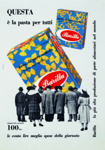
Erberto Carboni, Questa è la pasta per tutti, Pubblicità stampa per la pasta Barilla, 1959.
![Espositore in filo metallico e tubolare con ruote e targa smaltata per la vendita del prodotto confezionato, diffuso nei negozi a partire dal 1956 [ASB, BAR, I, Ri, Espositori].](https://www.archiviostoricobarilla.com/wp-content/uploads/2018/07/14.14-Espositore-212x300.jpg)
Espositore in filo metallico e tubolare con ruote e targa smaltata per la vendita del prodotto confezionato, diffuso nei negozi a partire dal 1956 [ASB, BAR, I, Ri, Espositori].
We are now in 1954 and packaging has fully developed and has become a true levering concept of commerce and also an element of communication, of which it is a protagonist. It is in the Diegenesis (the stories told by commercials) and it becomes the hero and the helper of housewives in difficult moments of home management.
From Carboni to the international agencies
The packaging designed by Carboni was created in 1956 and continued until 1970, though it underwent a number of slight modifications and restyling. In the 1970s, when Barilla was sold to the American multinational Grace, a lettering operation took place and “the pasta was cooked”, in the sense that the so called ‘contract of truthfulness’ was extended to include the act of consuming the food, and a photograph of the pasta boiling in a saucepan appeared on the packaging. In this contextual point of view the focus switched to the use of the product and was not on the product in itself anymore. In other words, the message of the packaging changed.
It no longer limited itself to saying: “I am a product and I am pasta”, but it added: “Consume me, put me in the saucepan, and do what I have been made for: cook me”. It was necessary to wait until the 1980s before a fork wrapped with pasta or with pasta tightly secured on it would appear in press releases, television commercials and on the packaging as well. This way to the “cook me” message, now it is possible to add a bold “eat me” message. The changes were due to the fact that the Barilla packaging was no longer designed by a single and genial designer, but the entire communication campaign was being taken care by an international advertising agency. It was TBWA that in 1984 took the pasta “out of the pot” and placed it on a plate, ready to eat. Meanwhile, recipes and other information had appeared on the back of the pack as important tools for the use of product, to elevate and give nobility to the image of pasta, by suggesting that with Barilla “it is always Sunday” and that it was always worth it to treat ourselves to a good Barilla pasta dish.
Recent developments
The important steps of the changes that Barilla packaging has undergone since the 1980s are the following. In 1985 Vittorio Mancini introduced the image of a fork picking up the pasta and placed it in the foreground in front of a consumer who is, in a figure of Rhetoric, an Ellipsis as it is not in the picture. In the early 1990s, in 1993 ad 1994 the phenomenon of Hard Discount stores began and to face this new threat to the market a remodeling of the packaging was decided. The famous Barilla blue was lightened, a window that showed the contents of the pack was introduced, and the logo was made more incisive. Another addition was the word Italia and the colors of the Italian flag to show that the pasta was now an international product. These were the first timid signs of a market on the way to globalization. On the back of the packages, recipes continued to be shown. In 2000 the window was made smaller and the appetizing element of a smaller fork filled with pasta reappeared. It is not possible to analyze these changes without viewing them in a wider context that takes into consideration the function and trends of packaging in our contemporary day. For this reason, before we move towards the conclusions of this analysis we will discuss the actual trends of packaging in the next paragraph.
![L’evoluzione della scatola Barilla nel tempo evidenzia la progressiva trasformazione dell’iniziale colore azzurro – colore “tecnico, chiaramente riferita alla carta per alimenti impiegata nel passato - verso tonalità blu sempre più intense, sfumate, tridimensionali e “psicologiche”. Si nota anche l’evoluzione dell’immagine della pasta, che da ingrediente secco, attraverso vari stadi, viene oggi rappresentata come cibo pronto da gustare [ASB, BAR, I, Na, 1954, 1969, 1984, 1985, 1996, 2000, 2002].](https://www.archiviostoricobarilla.com/wp-content/uploads/2018/07/14.15-BLUE-BOX-STORY-201x300.jpg)
L’evoluzione della scatola Barilla nel tempo evidenzia la progressiva trasformazione dell’iniziale colore azzurro – colore “tecnico, chiaramente riferita alla carta per alimenti impiegata nel passato – verso tonalità blu sempre più intense, sfumate, tridimensionali e “psicologiche”. Si nota anche l’evoluzione dell’immagine della pasta, che da ingrediente secco, attraverso vari stadi, viene oggi rappresentata come cibo pronto da gustare [ASB, BAR, I, Na, 1954, 1969, 1984, 1985, 1996, 2000, 2002].
Packaging today
What is packaging today? Which paths has it undertaken and where will this lead?
We do not intend to give an exhaustive analysis of trends, evolution and directions towards which packaging proceeds here. Seeing the vastness and the importance of the phenomenon, we could easily say that packaging is not going anywhere in particular or, rather, that it is going in all directions at once. Do we need proof of this? Let us list in chronological order some of the steps in the evolution of packaging, or of that which could be defined as the process of “ornamentation of merchandise”, using a new terminology whose lack we would not miss. Here are the main steps of the process, from bare product to the packaged one. The reader will excuse the necessary simplification.
The first reason to adorn a product with a sort of generic packaging was to protect it from the external world, dust and dirt. However, we should not assume too much about the level of hygiene insured by the packaging. This was an obvious need, and a mere consequence of another task the pack had to absolve. The first sheets of paper wrapped around the product with loving care, which hid it from sight and therefore turned it into a precious and hidden gift, answered first of all to problems of handling and transportation. This is the aspect that survives today in our neighborhood markets and of which Franco La Cecla has given an in depth description in his analysis of the anthropological aspects of packaging in the markets of
Palermo.
In food markets, the fundamental function of packaging still survives: transportation. Today this coexists with many other functions that in the course of time have become more important and pressing: hygiene, first of all, and protection, communication and lastly the most recent development that we define as ‘contextualizing’. The communication function of packaging arose when it became apparent that the packaging was hiding the product.
Initially, this process was simply performed by naming the product. Then the written sign transformed into a merchandizing category and the name into a brand (“Barilla Pasta”, “Fusilli”). Later, it was thought to aid communication by placing on the box visual information about the product. The latter was to remain hidden inside the paper, or carton, or plastic, but it could and should show its more or less faithful to truth information, like a photo, a drawing, an illustration, so to build what in semiotics is called “contract of truthfulness”.
In the contract of truthfulness between packaging and consumer, the figure of the product, for example the photo of rice on a box of rice, or of spaghetti on a box of spaghetti, testifies that the packaging is “telling the truth”: it hides a product that, after all, it really is inside. In that, it does not lie. The consumer must know this to be reassured. But such semiotic definition does not fully capture the significance of this visual gesture in many aspects introduced in modern packaging.
It is not only there to show and demonstrate the truth of contents that appear in photos and illustrations of the products, either a single content or one contextualized to the occasions of consumption. It is also and most of all because of the visual synthesis, the chromatic plan that this has, and the play of figurative representations that produce effects of meaning in any given illustration, that the packaging is considered much more appealing and can force absent minded consumers who roam the isles of great distribution or great distribution outlets to give their attention to a particular box placed on the shelves. We have defined this phenomenon that causes the attention of potential costumers to focus and that engages a dialogue, even for just a few seconds, and forces one to turn his head and pay attention: these phenomenon is related to the indexical factor of the packaging. The indexical factor of a packaging measures and explains why this can be attractive, in the sense that it is capable to attract attention.
Later on, with the addition of the ingredient composition, of nutritional values, of the correct (and advertised) recycling information for the packaging, and of all those texts useful to keep the attention of the consumer as long as possible on the pack, this transformed into a real discursive array. We have arrived to the most recent function of packaging. In this function the visual elements like photos, illustrations, and designs become a source of entertainment, most of all. It is not only a representation of the product seen singularly or in situations of use, but a visual evoking of specific characteristics of the product, as for example the vision of an Alpine pasture to illustrate the packaging of a brand of milk.
Such vision evokes, rather than delineating, and widens the semiotic function of the packaging, as this contributes to feed the world of that brand product, inducing in the consumer some specific and new sensations, related to the world of milk. The illustration of an Alpine pasture enriches the possible world of the brand with concepts and sensations, line the concept of nature, of untainted pureness, of tranquil and quiet life in great part now lost, that can be obtained by buying that specific brand. The promises of advertising – and the packaging is a concrete and extremely important vehicle of publicity – are all in this: the customer must be welcomed in the world of possibilities of the brand that evokes feelings and thoughts and suggests that if he buys the product he will really be able to experience them.
From means of transportation, to protective gear, to communicator, to issuer of a contract with the consumer, and at last to a true interlocutor placed on the same semiotic level of the consumer, the packaging has become full grown: what happens now?
Now it is a matter to see what types of discourses this interlocutor can in truth sustain. We need to immediately say that to behave as a real interlocutor, at least from a semiotic point of view, means to affirm that the packaging is a very important component of a communication mix that makes up the coordinated image of a brand. Equipped with profound semiotic competence and able to use it to conduct an adult dialogue with the consumer, so to speak, today the packaging has become excessive in its essence. Why is it so?
The function of dialogue has generated a social function that each time takes on different aspects of art, passion and myth. Let us explain this passage well. If the packaging is able to dialogue, that is, if it has been given semiotic qualities that enable it to speak, then this capability of being an interlocutor makes it a social agent in all effect. Such a dialogue allows it to be considered as defined both from and in the social texture, because at that point what it says can be analyzed.
Most of all, the way in which it communicates and the means and modalities of this communication can be analyzed. This way, that which a packaging communicates can become an object of art, for example. These are the reasons why a mythology of packaging is born: its discourse has become incredibly huge. It overflows its natural river bed to flood other social places; art, daily life, relationships with objects and people. The discursive production of packaging, its excessive insistence and persistence in the social and semiotic environment, is such that now we all feel “packaged”, caught in the fake packaging of ourselves in which our physical and psychological characteristics mix up with the ornament of fashion couture, or of a specific brand, a specific style, or a special group to which we belong, to which we entrust the representation of our own personal packaging.
In this sense, “packaging” today has become enormous, out of balance and excessive; even when it is minimalist, even when it negates itself and pretends that it is not presenting itself in a concrete and full form, but in a semiotic form like in the case of Lush cosmetics. It does not matter whether we are taking into consideration the packaging of the Polo super-candy, that of the vacuumed up sofa, of the artistic provocations of Antoni Muntadas. These are single cases or better single texts that express single aspects. But taken in their entirety, these texts together produce the dialogue of packaging in which the explicative element seems to be that of excess.
The excessiveness of packaging is in the entirety of the discourse that it brings forth, and not in its text. That is to say that it does not matter if some righteously sanctified criteria of ecology, or of respect of nature, push some types of packaging to be minimalist. It does not matter if some artistic criteria move in this direction as well, neither if marketing criteria want a packaging reduced to its minimal terms because there is nothing more communicative that the product itself. Therefore, we are going forth with full force with the idea that packaging tends to disappear to show as much product as possible (as it happened for Barilla and its windows on the box that make it possible to see the pasta inside). Lastly, it does not matter if the space requirements of the shelving of our super an hyper markets, together with the little space in our kitchen’s cupboards and generally in our homes, push us towards a miniaturization of packaging.
In the whole, these aspects of miniaturization paradoxically produce an excess of packaging because its discourse by now generates and produces infinitely. For sure, size matters, as the voluminous packages of Corn Flakes that take up three times the space of their content teach us. There is an entire trend of packaging that is excessive in size, and not only from a semiotic point of view. In addition to the packs of Corn Flakes, we can mention the voluminous bags of potato chips of all kinds, or the bags of cookies in general, or Pop Corn. Where does the oversize genre come from? It stems from a series of concatenated causes.
Large packaging protects the product more and if this is fragile, like cookies, the oversized dimension protects it better from hits and breakage. Moreover, large packaging covers any lacking and poor aspects of product, and donates it a dignity that it could not have otherwise. The appeal of a bag of chips is given by the colors, the happy puffiness of the bag that contains a certain quantity of air, and by the noticeable size of the bag. Just think of the sense of emptiness and sadness that unbranded potato chips give – those transparent bags that are stuffed with a lot of product and are void of any communication. It is indeed poor merchandise in a poor packaging, and besides, it is exactly sized for its contents. Moreover, the consumer does not accept this since the convenience of ‘value for money’ does not seem to be enough to fully gratify him. That is the reason why the unbranded or private label packaging of potato chips have not impacted the leadership of the extremely colored packaging of PAI chips, for example.
The third reason for excessive packaging in concrete regards the various packs of laundry detergents. Historical reasons have produced very large laundry soap casks – these reasons were linked to a consume situation in which to have a lot of product meant to have made a great deal. Today the tendency has partially been inverted and the entire sector of detergents communicates the fact that using just a little product you can wash, soften, deterge, degrease, clean and remove crusts of soiling from wider and wider surfaces. But the two tendencies, the one that states that you can clean much with a little, and the one of making a bargain by buying lots of soap, coexist. So we find the various products like Svelto (dishwashing soap), CIF, but also the various Johnson Shampoos in family size of sold in 30% extra free product. The packaging serves to show such addition through a noticeable oversize.
But truly the concept of excessive dimension in packaging resides in the order of discourse which has become multi directional and out of proportion, besides what we see in the cases we analyzed above. Packaging reaches everywhere because it is not a text, nor it is a theory of texts, but rather it is a real discourse, with its configurations, themes and figures of speech. And like every object that has an evolved set of semiotics, the packaging is over priced. It speaks of itself and demands attention and it engulfs other discursive configurations, first of all artistic ones. In this sense the work of Antonio de Pascale who builds huge packaging with extravagant, unlikely and contradictory illustrations has been able to conjugate the concrete and semiotic excessiveness. His series of works entitled Zoom are a witness and an outcry of this phenomenon.
Conclusions
At the end of this short analysis of the diachronic evolution of Barilla packaging and of the comparison with the study of modern packaging, we can attempt at drawing conclusions.
Barilla, by choosing for itself blue, a more psychological and less commercial color that the “sugar paper” azure from which it started, has presided the area of emotional and Tìmia (truthfulness) reality. In this area, the color blue manifests itself as a state of the soul and not as the definition of a brand.
If the color blue at Barilla is required is because it is overloaded with psychological values that tell something about the world of possibilities of Barilla. This is a heritage to keep because the world of possibilities of a brand reaches its maximum capacity of welcoming the consumer when it structures moods and feelings and not only systems of expectations. The blue of Barilla is finally become a Tìmia (truthfulness) form, by going through the field of that which surpasses the senses, the field of emotional response, of passionate engagement, and not simply through the tangible dimension which is, indeed, a color, a definite shape like the big M’s of McDonalds can be, or a graphic sign like Nike’s swoosh.
It is sufficient to see it to become emotional with passion for the product and to become aware of a theory of sensations, like beauty, superiority, pureness. These are the feelings that are generated when one comes in contact with the world of Barilla’s possibilities.
The color blue is a potent generator, even though not the only one, of such emotional states.
Bibliography
BSN Emballage, Le pack. BSN Emballage, 1987.
FABBRI Paolo, “Introduction” to Algirdas Greimas, Dell’imperfezione (of imperfection), Palermo, Sellerio, 1988.
GREIMAS Algirdas, Dell’imperfezione (of imperfection). Palermo, Sellerio, 1988.
MINALE Marcello, Dall’ancora alla zebra. Come aver successo nel mondo del design (from anchors to zebras, how to be successful in the world of design). Milan, Lupetti, 1991.
CARRON Gérard, Un Carré noir dans le design. Paris, Dunod, 1992.
IVARDI GANAPINI Albino, GONIZZI Giancarlo (edited by), Barilla. Cento anni di pubblicità e comunicazione (one hundred years of advertising and communication). Milan, Pizzi for Barilla, 1994.
HINE Thomas, The Total Package. New York, Little, Brown and Company, 1995.
BUCCHETTI Valeria, La messa in scena del prodotto(the products stage setting). Milan, Angeli, 1999.
CARMAGNOLA Fulvio, FERRARESI Mauro, Merci di culto (cult merchandise). Rome, Castelvecchi, 1999.
FERRARESI Mauro, Il packaging, oggetto e comunicazion (packaging, object and communication). Milan, Angeli, 1999.
CODELUPPI Vanni, Lo spettacolo della merce (the spectacle of merchandise). Milan, Bompiani, 2000.
FERRARESI Mauro, Pubblicità e comunicazion (advertising and communication)e. Rome, Carocci, 2002.
LA CECLA Franco, “Viaggio al mercato” (a journey to the marketplace), in Impackt, 1, 2002, p. 26.