In December of 1975 the new brand of oven products by Barilla was born: Mulino Bianco (White Mill). This was a “revolution” in the world of bakery products because alongside with pastries of undeniable goodness, the advertising and the entire apparatus of relative service (shape of pastries, packaging, colors, etc.) for the first time was heavily based on such themes as memory, nostalgia, dream and emotional involvement. All of these elements were constantly present in the advertising communication of the brand thanks to the use of transverse language that reached all targets. Though in the beginning it was the book to open the advertising of Mulino Bianco, at a thirty year distance the pages of the story of the Mill still represent those values that made it a declared example of global communication: simplicity, sweetness, a little pinch of surprise and nostalgia.
The Mulino Bianco Story
The values of the brand and the imaginary collective
The Origins (1973-1975)
1973 – the Kippur War between Arab nations and Israel and the consequent embargo of petrol were a shock to the Western World which was forced into fuel rationing and to “invent” the car-free Sundays.
Inflation rose quickly and the Government locked the retail prices of basic necessity goods, among which was pasta, and the manufacturing companies had to face the raising cost of raw materials.
Being essentially a single product company, Barilla was being squeezed in this vice, and pointed all of its resources on diversification, and to products that were not subjected to moderated price: thus, after two years of research the “Mulino Bianco” line was born. In a short time, aside from cookies, it was destined to include snacks, cakes and breads, products with simple recipes and natural ingredients.
History of a Brand
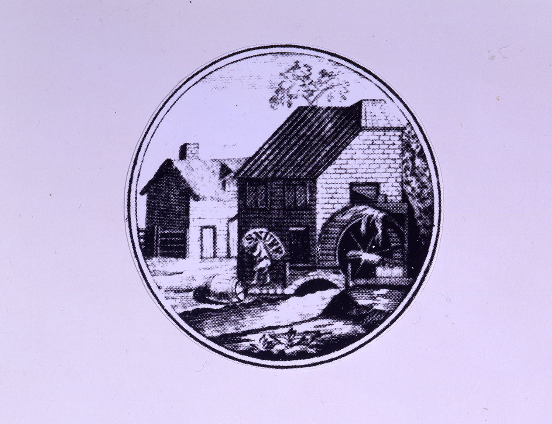
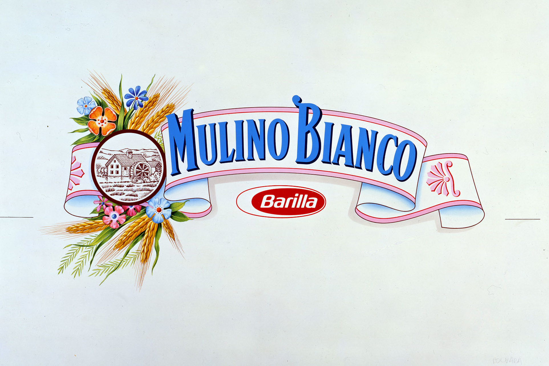
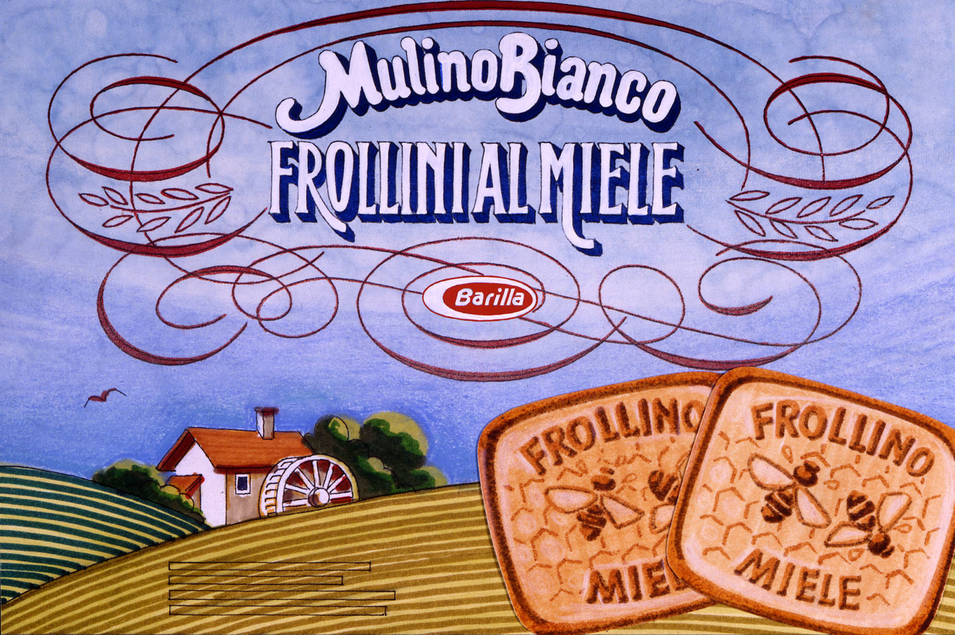
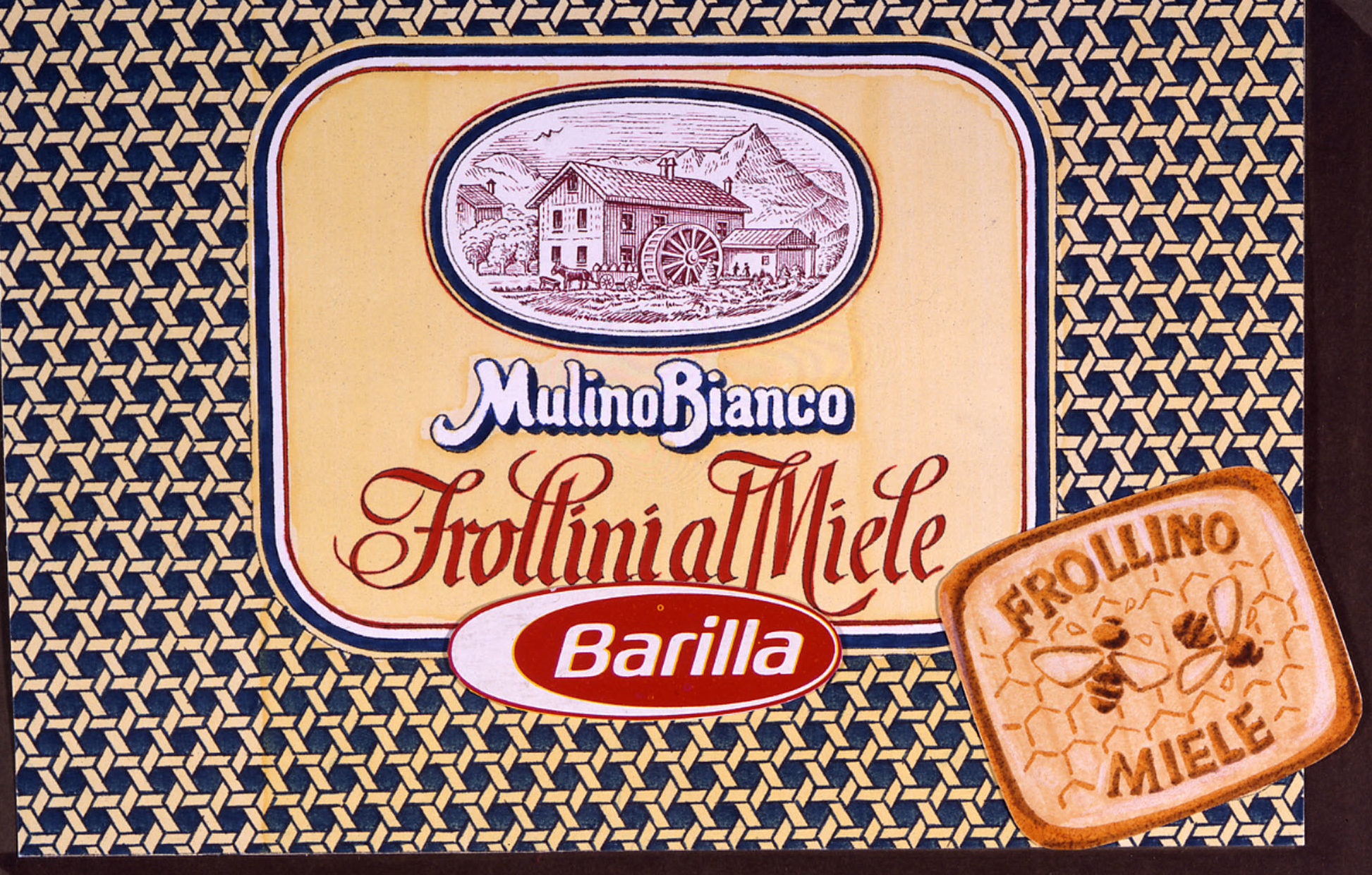
1974 – Once the area of action of the new product line was identified, a suitable system for communication had to be created. According to market research, the Barilla brand in the eye of consumers was identified only with pasta, therefore it was decided to create a new brand for cookies to represent the values of tradition: “good things from old times”. And so the “Mulino Bianco” brand was born as a result of the combination of three elements:
-
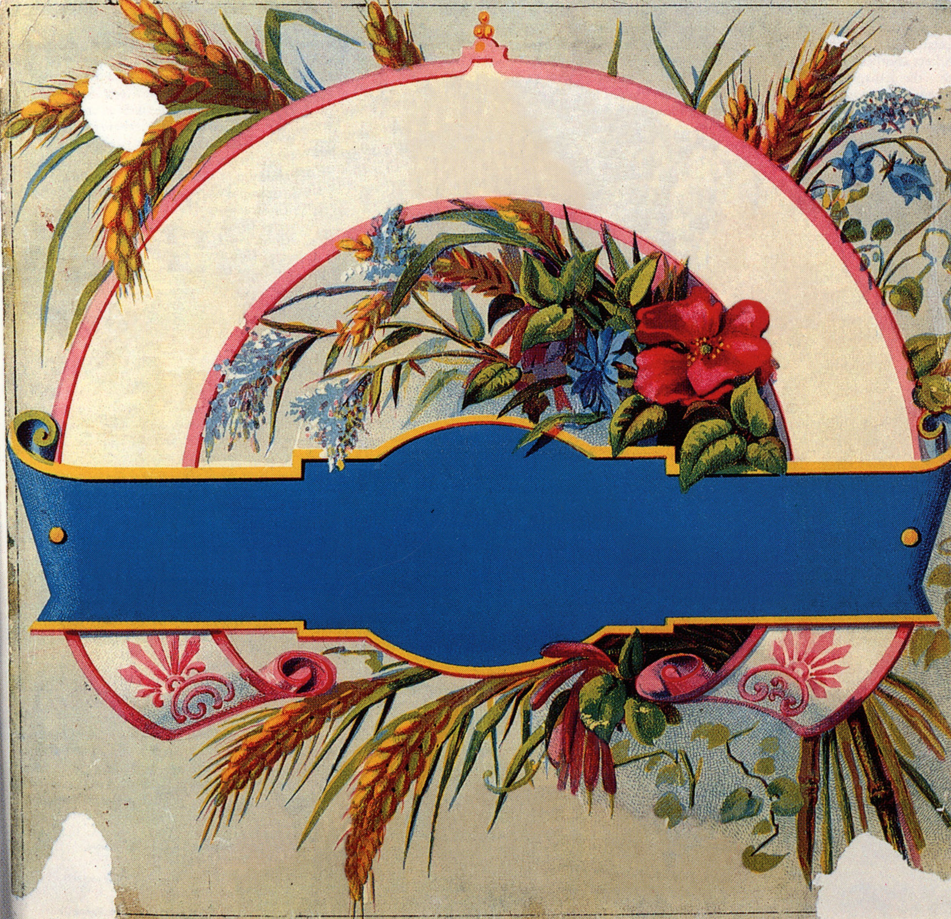
the ears of wheat and flowers, elements that expressed the concept of natural goodness;
-
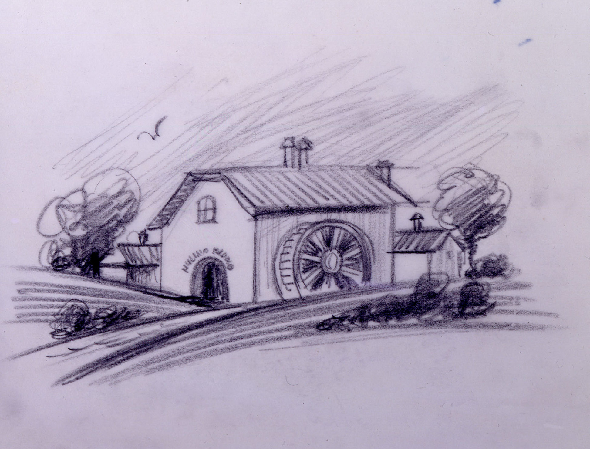
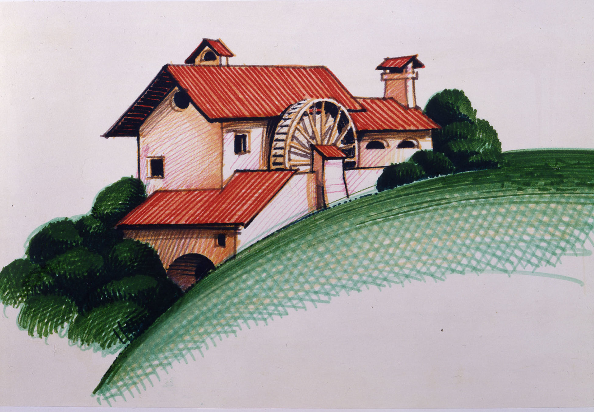
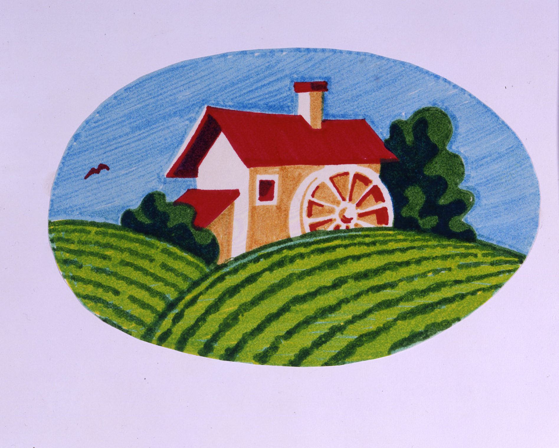
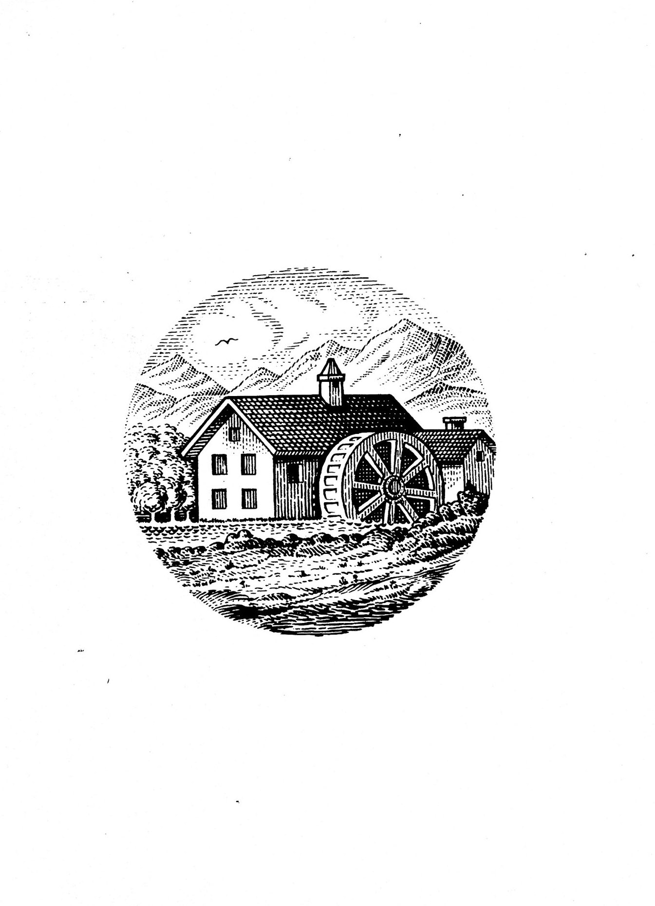
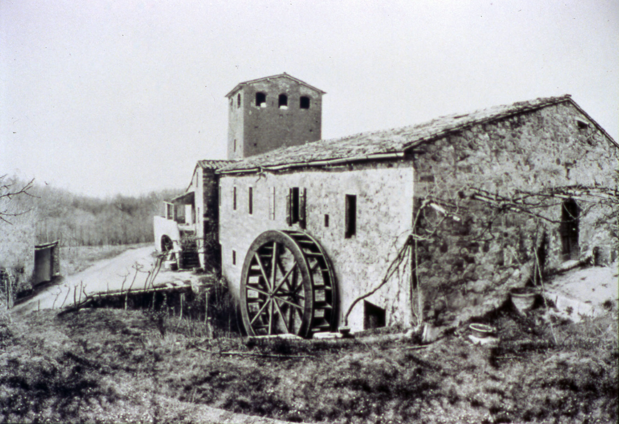
the image of the small mill, evoking traditional values
-
the name “Mulino Bianco” (White Mill), as a synthesis of the values of Nature and tradition in the two concepts of genuine foods and good health.
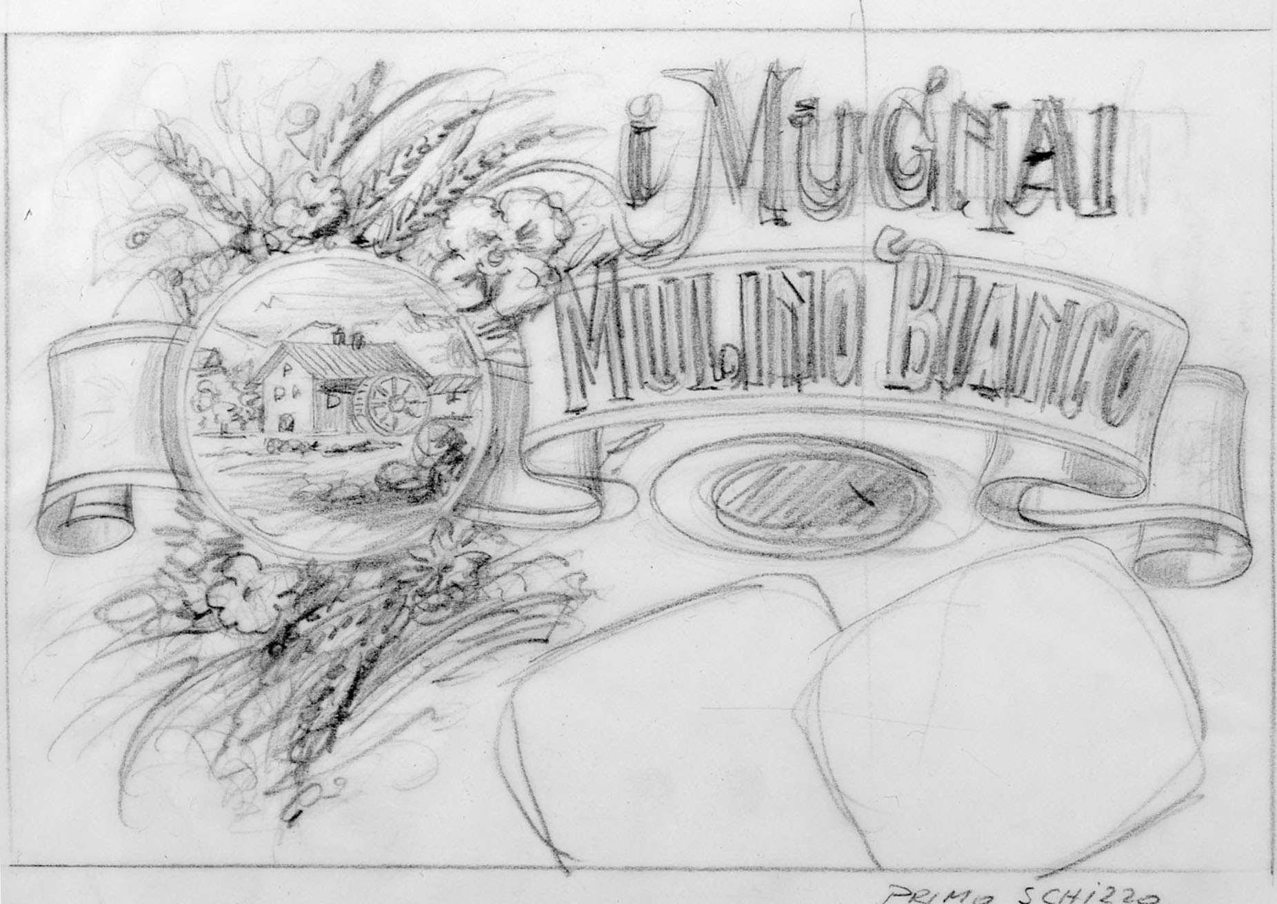
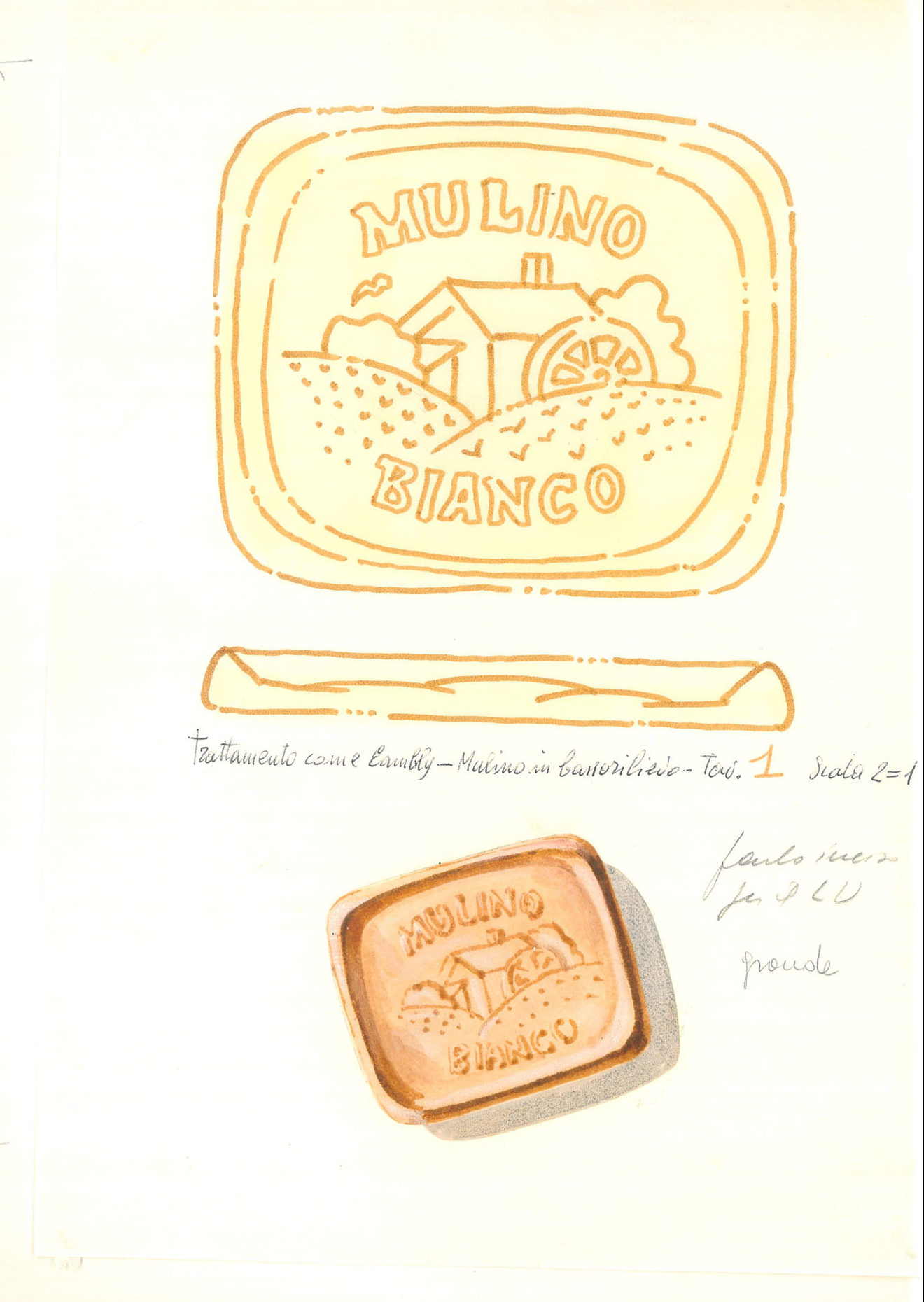
The long path of elaboration for the Mulino Bianco brand was characterized by wide research of original graphic elements. Old engravings of the 1800s, mostly of English provenience, with images of mills and friezes decorated with sheaths of wheat and wild flowers, gracefully painted in watercolor or printed in chromium lithograph supplied the inspiration to the elaboration of the final logo. By opportunely combining the name for the brand that the Company had found together with the historical, psychological and graphic design elements collected through months of research, the Gio’ Rossi studio sketched the first lay-out of the Mulino Bianco logo. The final version was drawn by the hand of Cesare Trolli, who had a lifelong experience as in the field of drawing and chrome lithography for cookie boxes. He skillfully recreated an Art Nouveau graphic style.
From England to Mulino Bianco
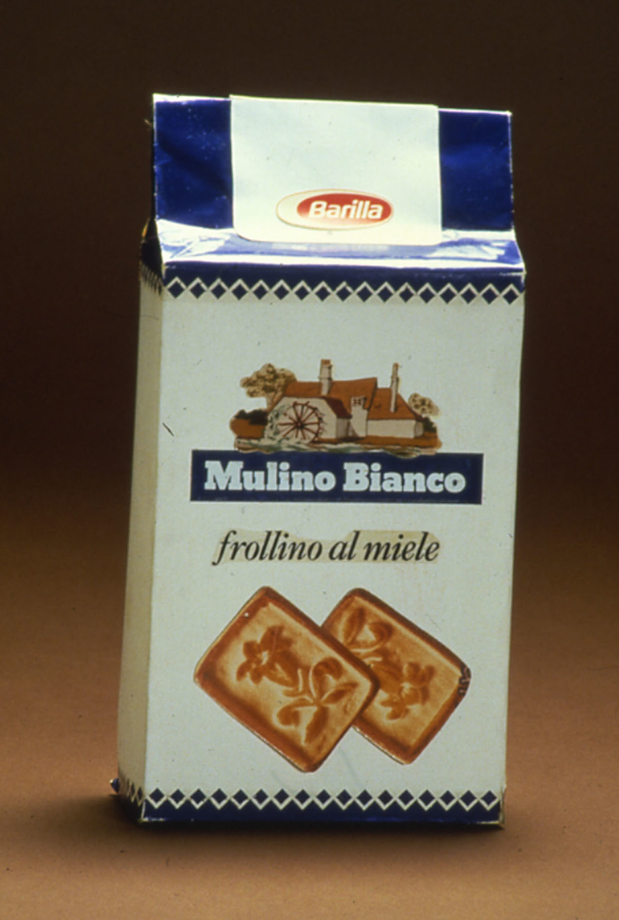
The long history of the Mulino Bianco packaging has its origins in the Anglo-Saxon tradition of tea. The Dario Landò and Sergio Mambelli creative group that was called to elaborate the product’s packaging went from the initial line of Barilla cookies in Biscuit House or Mary Ann style and from references and suggestions to England, considered to be the hypothetical birth nation of cookies, to the first solutions branded with the Mulino Bianco symbol, and characterized by the presence of the silhouettes of the cookies. But it was Gio’ Rossi to design the final display of the packaging.
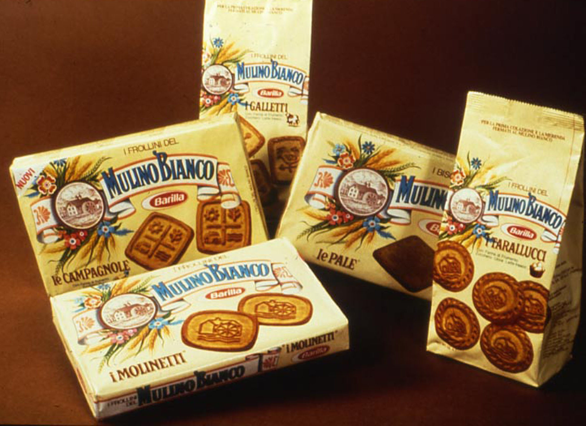
The introduction of the “bag pack” that recalled the bakers’ wrappers – designed with the occasion of a visit to the Cologne food exhibit in mind – gave the product line its definitive look, characterized by a yellow tint that was evoked in Gio’ Rossi’s memory by white chocolate. The goodness and natural wholesomeness of the product were further underlined by the recipe and the genuine ingredients, which have since been listed on the side of every package.
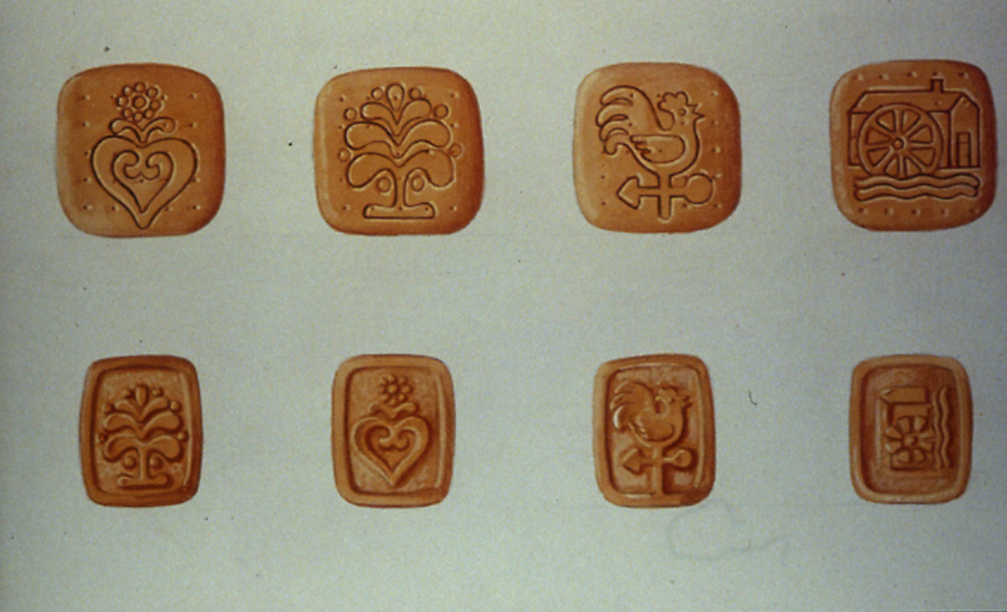
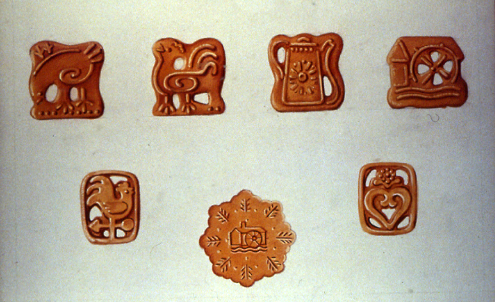
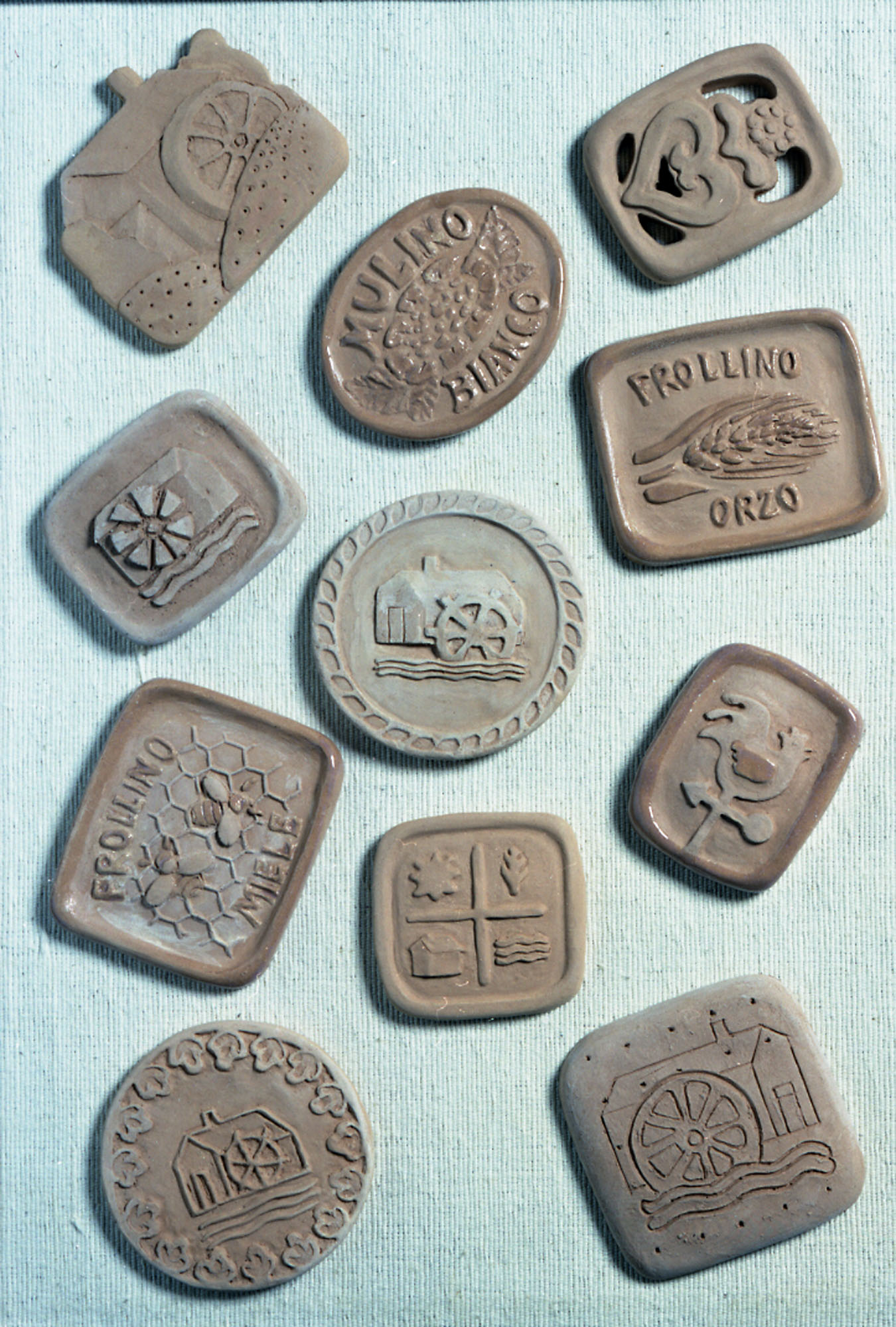
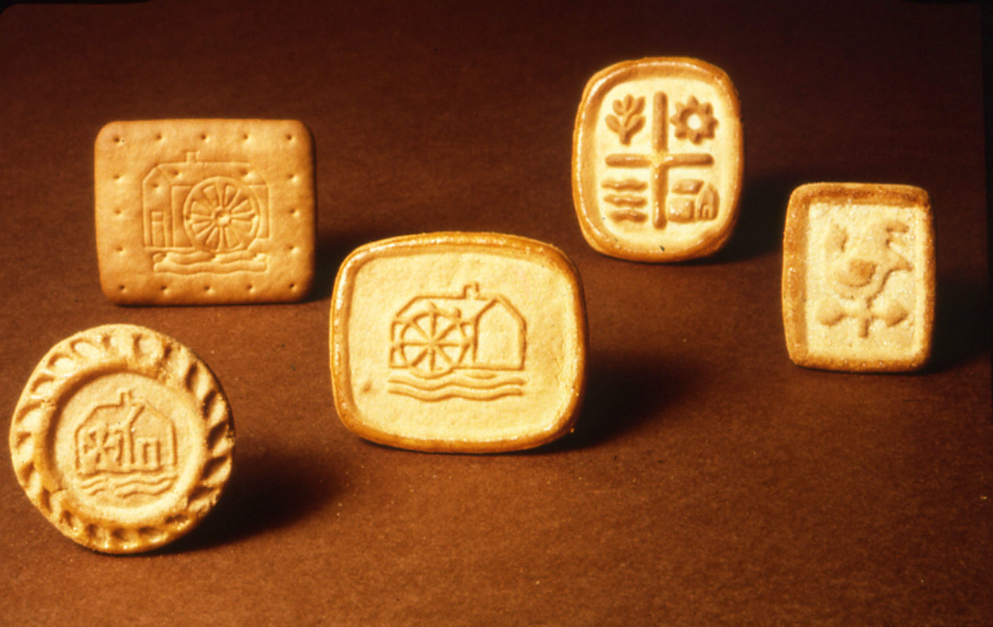
But the evolution of the brand could still not be considered closed. While expert cookie maker Edward George Maxwell was developing a number of recipes for new cookies with rigorously natural ingredients and without any kind of additives or preservatives, the two creative groups worked on defining shapes and names. In a time in which industrial cookies all looked like buttons, introducing a symbolic iconography in the product’s project was a real revolution.
Once again, hundreds of hypothetical choices were brought forth, from rustic style, to country style, naif, and in the end among those proposed by the Landò and Mambelli group 73 different formats were registered with their specific names.
The names where drawn from an ancient lexicon and evoked a farming atmosphere from times past, so Tarallucci (little ring shaped biscuits), Macine (millstones) and Galletti (cockerels), very soon became successful names destined to lead for almost twenty years with no competition the hit lists of Mulino Bianco cookies. But at the same time the Rigoli (striped cookies), Mugnai (millers), Campagnole (country ladies), Molinetti (little mills), and Pale (mill sails) were born: the first of a long series of sweet treats.
The designs and shapes of the cookies, tested on a small experimental line secretly set up in a Barilla warehouse, had to look imprecise on purpose, to give the idea of a “non industrial” cookie, but at the same time had to be functional: they had to stay unbroken during the production, packaging and transportation process and had to arrive intact to the customers. After months of experiments, the first five cookies of the line were finally born: Campagnole (country ladies), Galletti (cockerels), Molinetti (small mills), Pale (mill sails) and Tarallucci (small ring shaped cookies) in their final shapes were ready to be presented to the public.
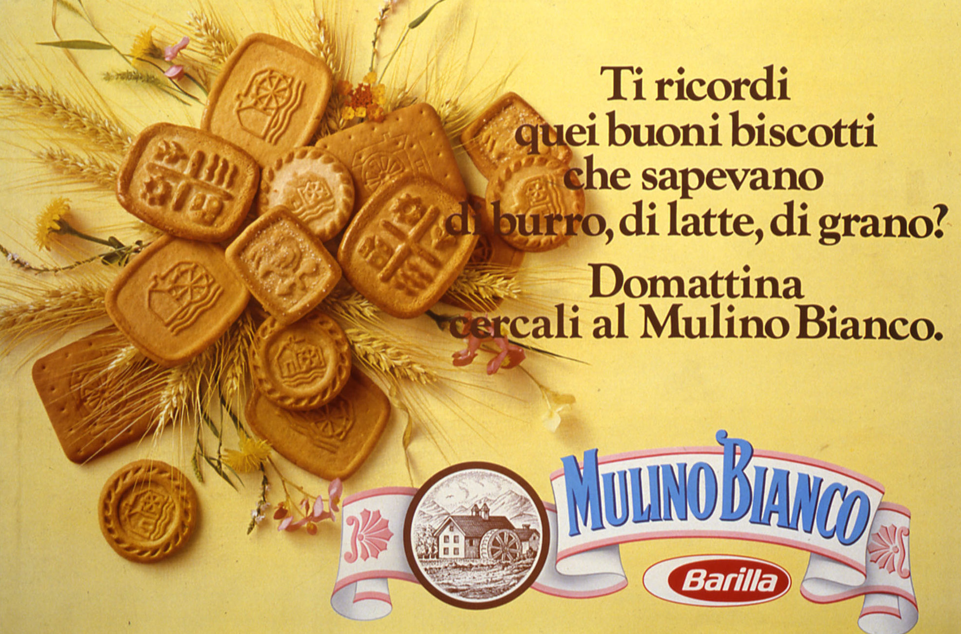
1975 – The newly born brand, because of its symbolic characteristics, already spoke for itself. It was already a self standing advertising campaign, a synthesis of values and meanings that could be immediately perceived. Thus, the first announcement for the cookies, elaborated by Dario Landò and Sergio Mambelli in 1975, showed just the new cookies and the new brand on a yellow background. But once again, in order to arrive to a final design, a number of hypothetical ideas were brought forth and all the roads were explored, all centered on the theme of genuine food, and of a rustic return to country life that had to be “kept secret” from city dwellers. Other ideas proposed for the printing press advertising campaign were inspired to the style of the packaging, The “good things of time past” and the “taste of the countryside” were once again at the center of attention.
So, on the wave of the memory of a joy to rediscover, Mulino Bianco began its first steps. Mulino Bianco was the meeting point of a long series of intuitions refined by several work groups: from the idea of genuine and rustic food, to the recipes using natural ingredients and the shapes, to the names of the cookies to the choice of the sack pack, to the logo and dominant color, which all are characteristics that still mark all of the products of this line. The harmony of all these elements expressed in an effective way by the advertising campaign represented the secret weapon to launch a new brand that had changed all of the rules of the game. Thus, when the white ribbon that marked this birth in the Barilla house officially saw the light, it was already sufficiently robust to face the challenges of the market.
Those had not been fortunate years for the sector of bakery goods. The picture was alarming to say the least: Buitoni, Chiari & Forti, Plasmon, Pavesi, Lazzaroni and many more production companies were either missing the launching of new products or were languishing. It went differently for Mulino Bianco, that as early as 1976 had registered good marketing success, reaching the quote of 7%. The market leadership in the sector of bakery goods arrived in 1979, the year in which Pietro Barilla (1913- 1993) took on the reins of the family company that had been sold in 1971 to the American multinational Grace. The increase in earnings in the bakery sector increasingly grew throughout the 1980s reaching in 1986 the levels of the pasta sector. This was an economic success that matured thanks to the quality of the products and to the fortunate intuition in the field of advertising communication.
When mills where white… (1975-1984)
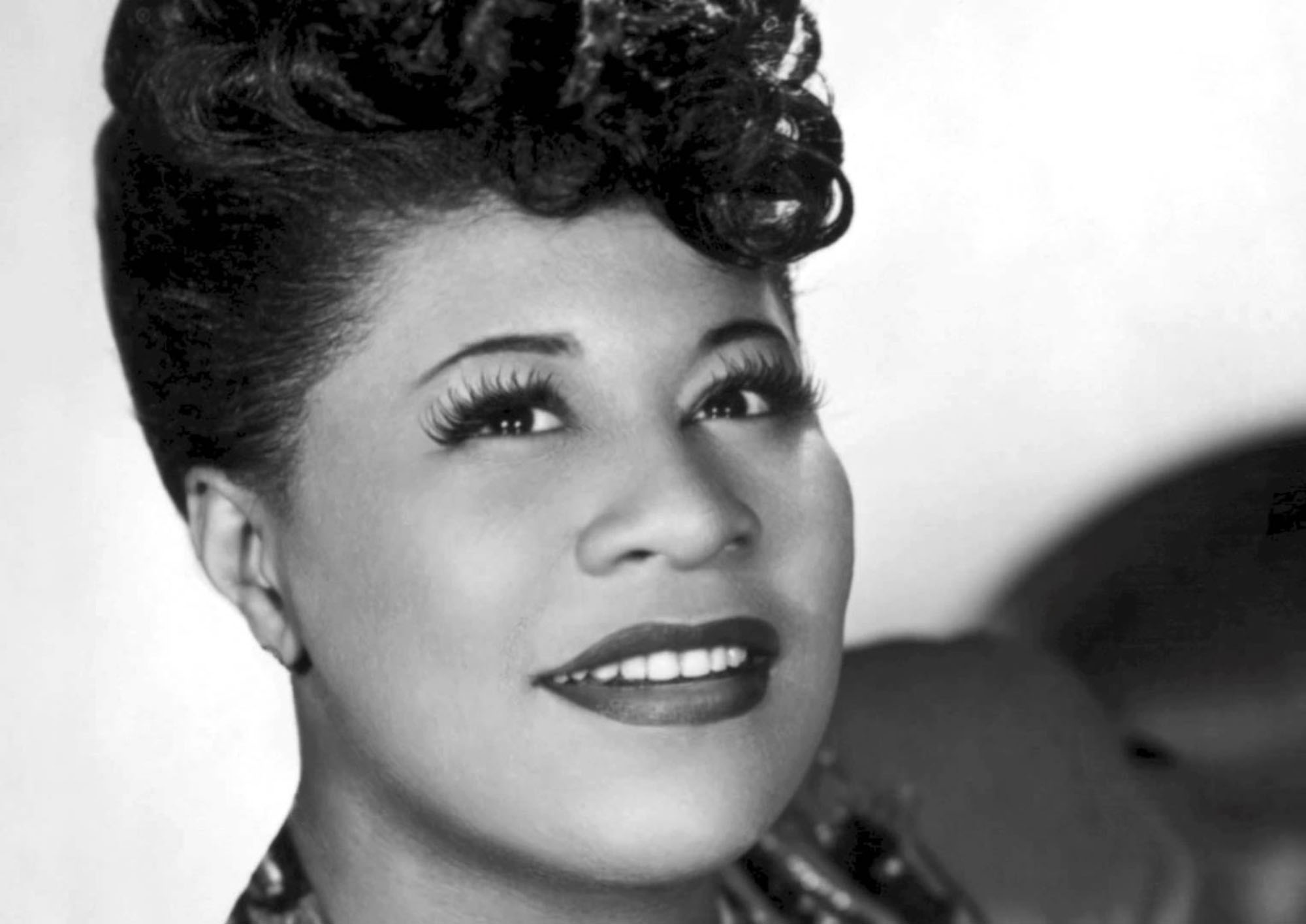
1975 – After two years of study and research the first communication announcements appeared in the press at the end of 1975. In 1976 the Barilla Grissini and Rusk bread became, between worries and hopes, Mulino Bianco Grissini and Rusk bread, and in one year the market quote went from 15 to 20%. In 1976 Mulino Bianco landed on television with a series of “Carousel-rhymes” based on the idea of a “memory lane”. The initial idea had been the voice of Ella Fitgerald who, with her intense voice on the melody notes of Moon River and her dark face was to be a juxtaposition to the whiteness of the mill: unfortunately, she became ill and the idea did not become a reality.
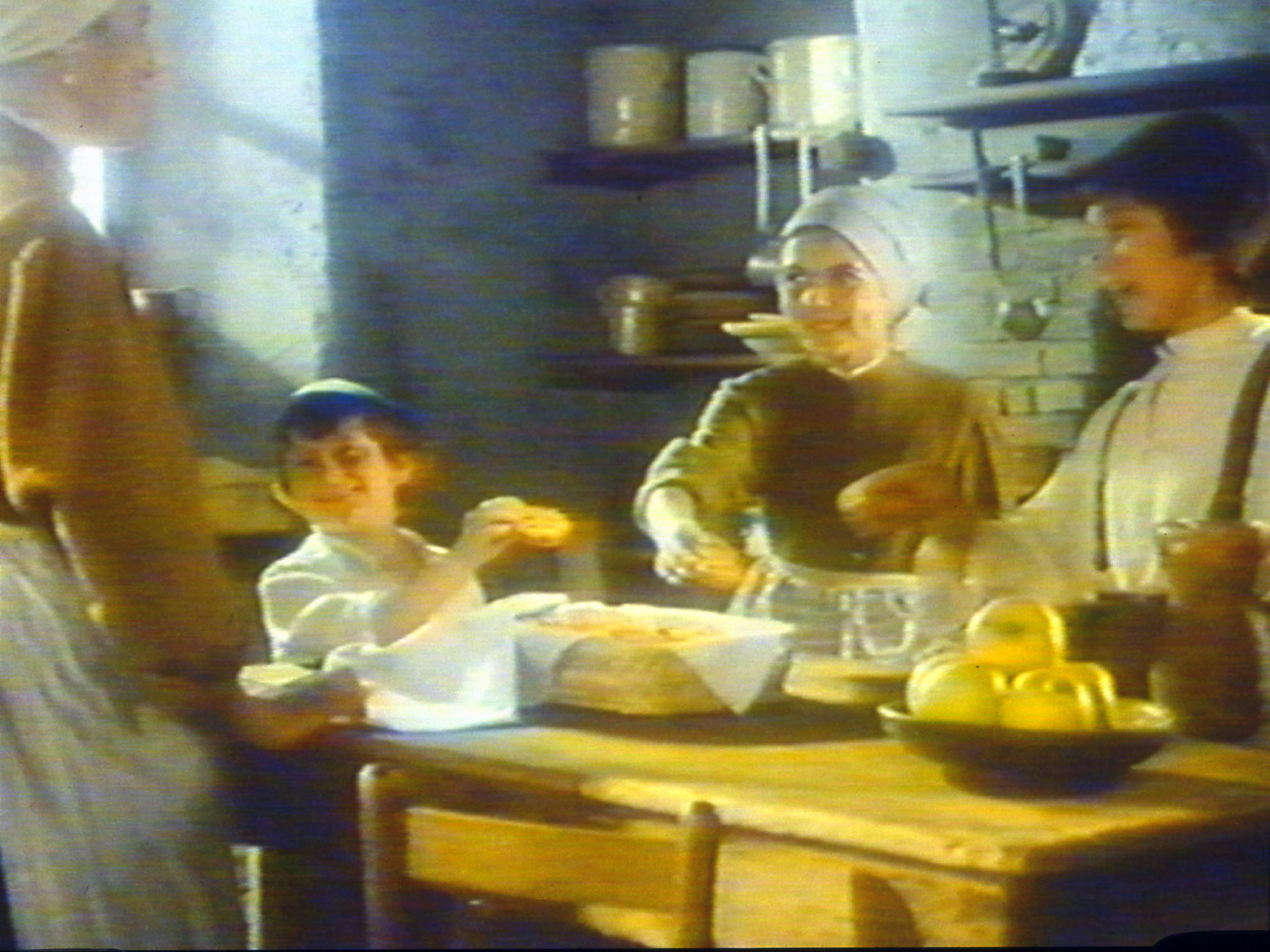
Then the idea became to evoke the sweet lullabies sung by a mother, to suggest a world that appears tangibly in but a few ears of wheat. The music – written by Franco Godi (Milan, 1940 -) recalls somewhat the notes of the theme of Sayonara and accompanies the first television spots “drawn” on the green hills on blue skies: they called it the Happy Valley. A delicate voice pronounced new words: “Do you remember those good cookies that tasted of butter, milk and wheat? Tomorrow stop by the White Mill”… But the second campaign series – with the spot that made history with a child riding a horse, still in black and white – already collocates itself in a rustic environment, paying attention to the value of sentiments. In January 1978 – Carosello (Carousel, the Italian TV program featuring advertising spots) had been dead for a year and “The Tree of Wooden Shoes” by movie director Olmi was to premiere in a few months – a long saga of the country world begins, in which the diluted atmosphere presented the value of small things, making you taste them.
“When mills where white…” seems like the beginning of a fairy tale and in the television advertisement the pencil marks and drawings looked like they came from an elementary school book and faded into the scenes of an ancient farming life picture Pn the printed advertisement, the single letters of the alphabet were surrounded by the symbols of genuine ingredients almost as if they were miniature letters in an ancient manuscript codex: butter for the Campagnole (country ladies), ears of wheat for the Molinetti (small mills), a hen with eggs for the Tarallucci, a cow with fresh milk for the Rigoli (striped cookies)…the communication system for the Mulino Bianco had as a resource also the creative use of promotional objects, tightly connected to the context represented by the advertising communication.
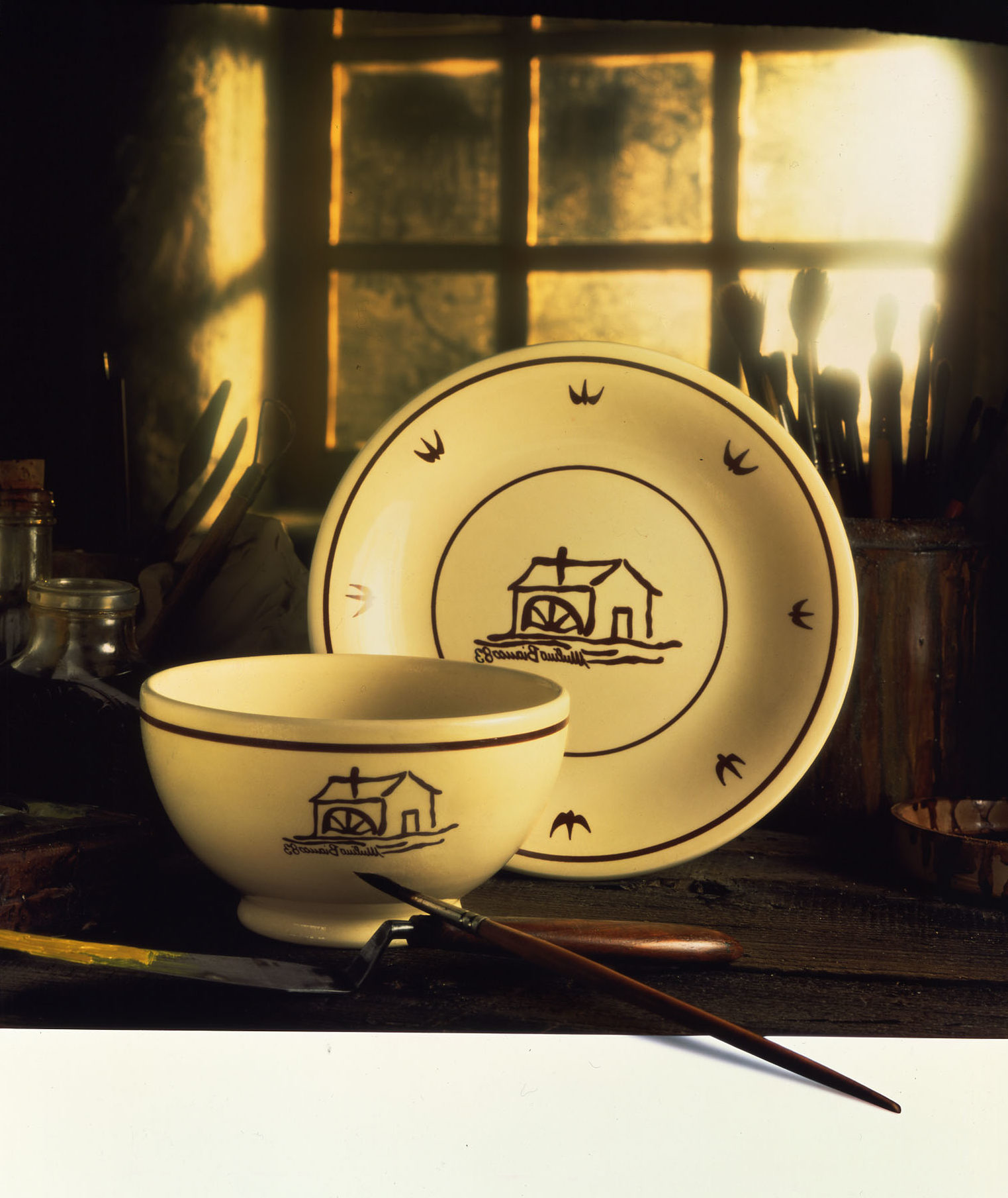
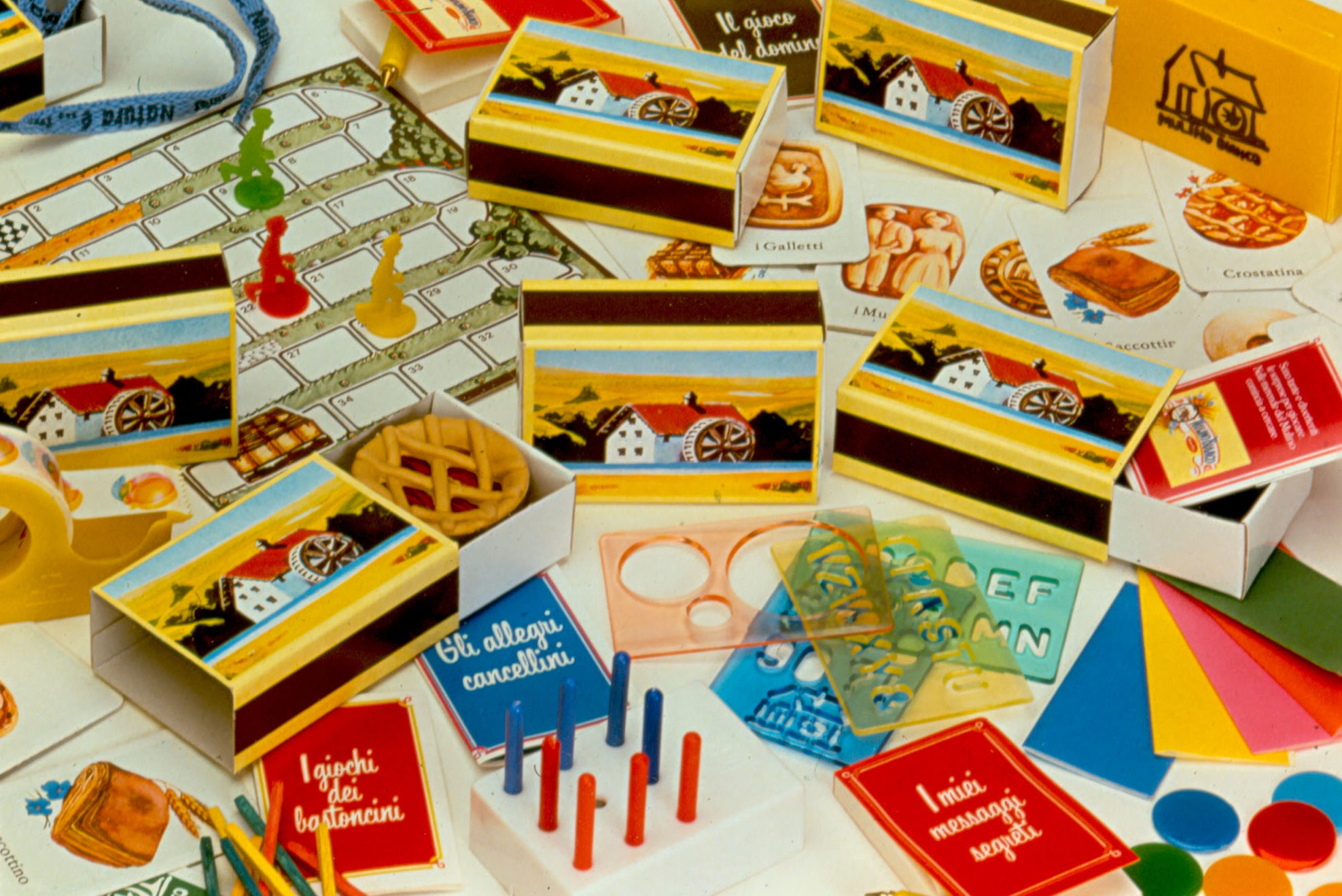
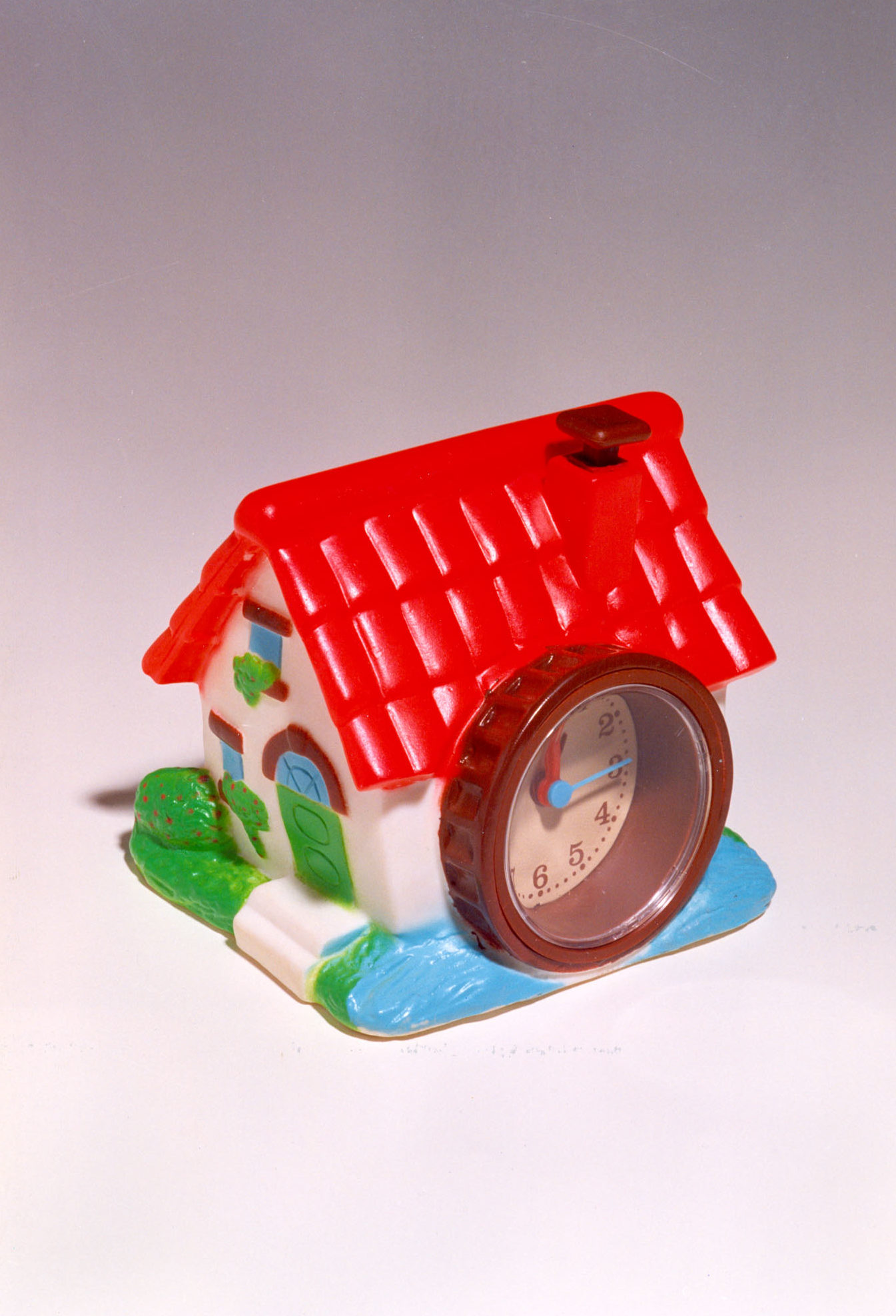
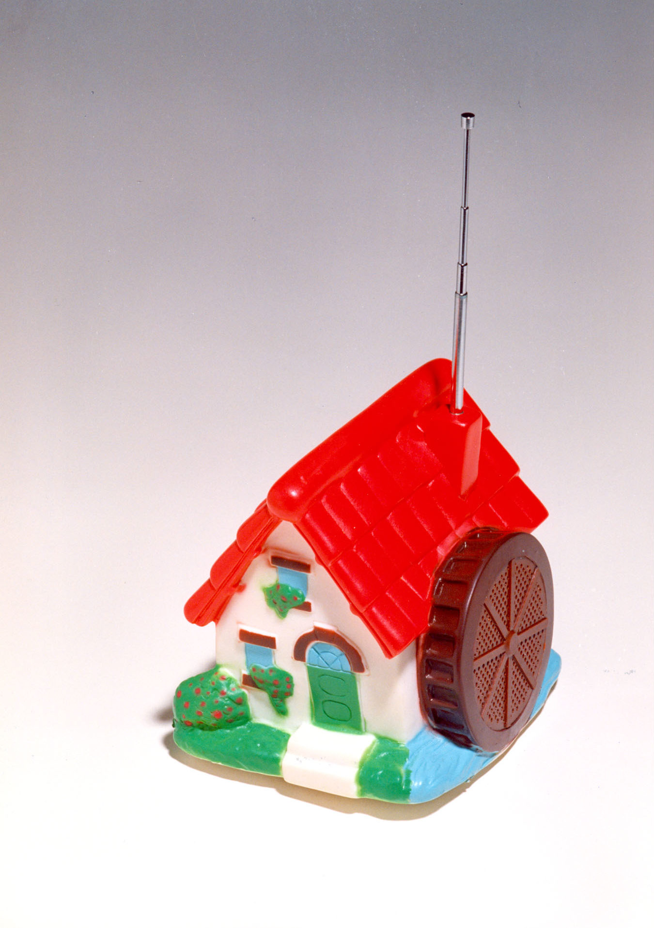
So in 1984 the “Coccio” was born – a simple terracotta dish – as a collectible gift and at the same time as an advertisement, and it was the first born of a long series of collectibles: cups, sugar bowls, cookie jars, milk jugs, teapots, dishes, trays and tablecloths with the unmistakable yellow background and slightly naif drawings that were intended to reward the fidelity of consumers. This object evoking the world of farmers and therefore perfectly in line with the brand’s philosophy, arrived in the homes of about six million Italian families: it was a successful operation which was later confirmed by the other collectibles issued (sugar bowls, cookie jars, milk jugs, teapots, dishes, trays…) that came during the course of the 1980’s which was the decade of collectible gadgets per excellence (the same period of Sorpresine –little surprises- which consisted of 650 different figurines packaged in the unforgettable look alike match boxes inside the packages of snack cakes, and that became one the favorite moments of children’s life).
In 1980 on television and in the pages of magazines a little bell rang to announce the arrival of new sweets. The cookies were joined side by side by snacks and the range of oven baked products became wider. In 1983 the “Dolcetti delle feste” (the little desserts for celebration days) were launched. These were delightful patisserie biscuits with suggestive names: Canestrini (little woven baskets), Baiocchi (horse carriages), at first contained in an exclusive “tower” packaging expressly designed by the Barilla technical experts, and later miniaturized and packaged in mignon bag packs.
In 1985 the fortunate market positioning of Mulino Bianco and the changes that occurred inside the specific market sector made it possible to launch the “Sfoglia di grano” (wheat sheets), the Crackers of the Mulino (mill), that became successful because of their natural ingredients.
The Era of Sentiments (1985-1989)
The second half of the 1980s saw the clear affirmation of the Mulino Bianco brand and the creation of a number of new products: in 1987 Pandolci (sweet breads) and Frollini Ricchi (rich dunking cookies) were born: Pan di Stelle (star breads), Ritornelli (refrains) and Abbracci (hugs), the latter being characterized by two different colors of dough.
The communication system of Mulino Bianco, centered for more than ten years on the myth of an arcaic and serene farmer’s world, evolved to suit the new social sensitive issues: in 1987 a contemporary character was inserted in the commercial spots: the Girl with a guitar who sang the text composed and set to music by Bruno Lauzi (1937-2006) and presented the life of the fields in a more symbolic rather than a realistic manner, more like a representation than as a narrative. The operation, though, was not fully successful and the Young & Rubican agency abandoned the idea of a rustic setting to represent again the values and sentiments of that world in the reality of everyday life.
In 1988 the Pani Morbidi (tender table breads) joined the classic Pan Carrè (toast bread) and Pagnottelle (small buns); moreover, the Granetti (small grains), crisp table breads, were launched. The year 1989 saw the birth of Grancereale (grand cereal), a digestive cookie particularly rich in fibers, and of the Camille (daisies), tasty snack size carrot cakes.
A Home in the Green Fields (1990-1994)
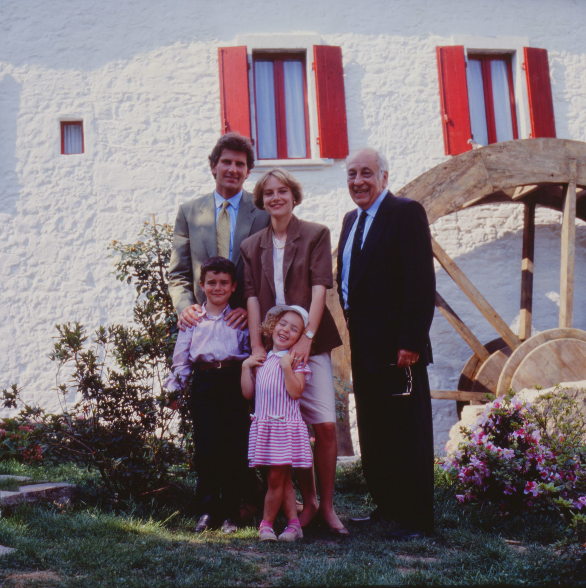
Starting in 1990, the Armando Testa agency took over the management of Mulino Bianco communication, and proposed the theme of an advertising serial based on a modern day family the leaves the city to “go live in the green” of an ancient mill. Therefore the adventures of the Family of the Mill began: a school teacher for a mother, a journalist dad, a grandfather and Linda and Andrea, their lives where narrated by the movie director Giuseppe Tornatore (Bagheria, 1956 – ) on the notes orchestrated by Ennio Morricone (Rome, 1928 -) and captured the attention and affection of millions of consumers.
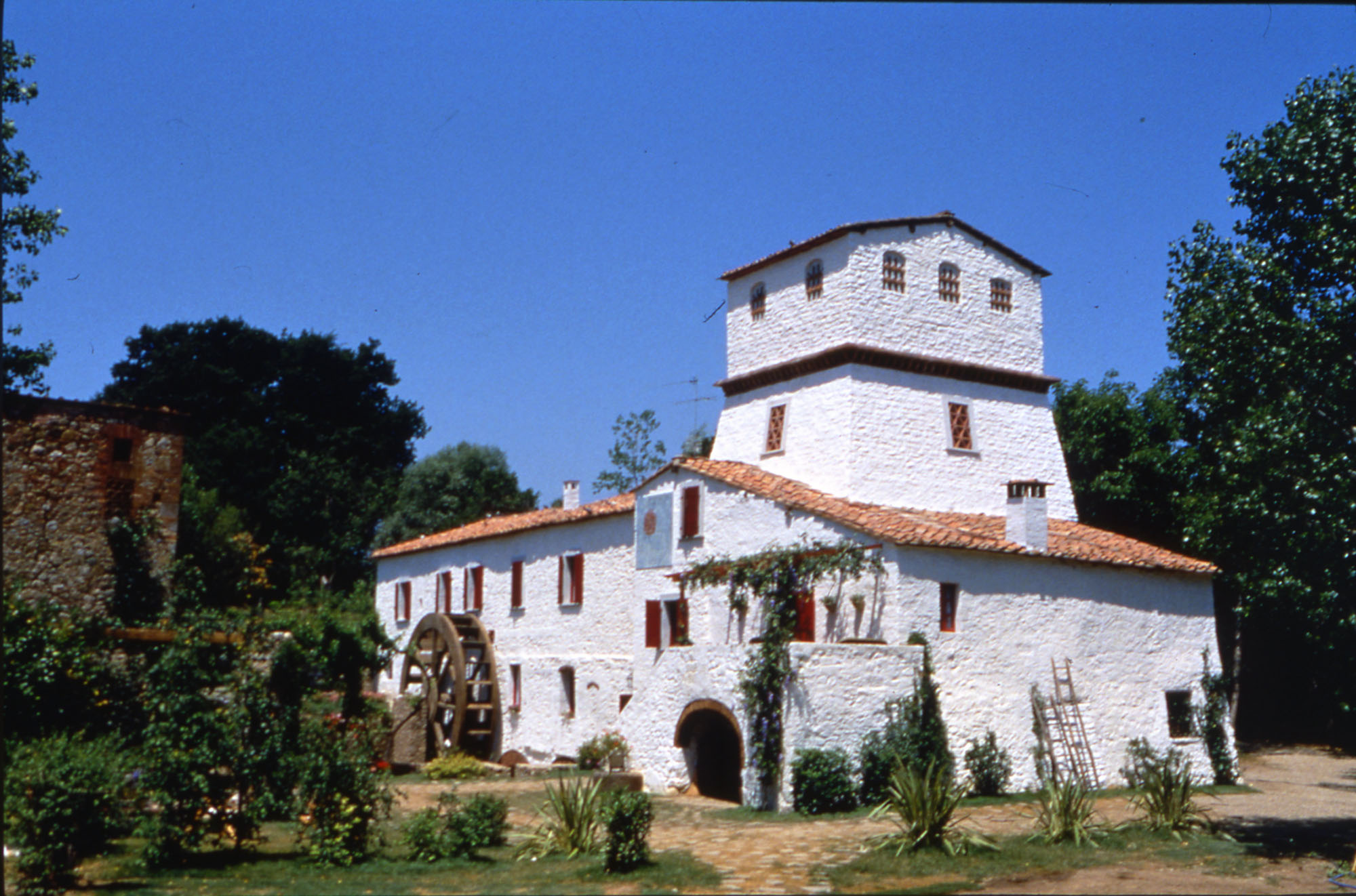
The Chiusdino mill, in the province of Siena, became the scene of the numerous series of tv spots launched in 1990 featuring the Family of the Mill created by Silvano Guidone, who then was the Creative Director of the Armando Testa agency. The printed press publicity on daily newspapers and periodical magazines underlined the natural goodness of ingredients and the nutritional aspects of each product.
More new products were created: from Pangrì (bread sticks) (1991), the innovative bread sticks that tasted like bread, to Michetti (1992) , to the Cuor di Mela (apple hearts) (1993), sweet pastry stuffed with pieces of bread, winner of the Vassoio d’Argento (Silver Plate Award), the prize for best bakery sweet product of the year.
Nature in the City (1994-1999)
After five years the communication evolved once more. The now predictable Family of the Mill was abandoned, and the theme of coming back to the city was chosen, in the conviction that eating in a balanced way could make it possible to regain the genuine feeling of nature even in the midst of frenetic metropolitan life: the focus switched from communicating an atmosphere to communicating a product. So in 1994 the squares of Rome, Florence, Venice, Milan, Bologna and many other cities of Italy, thanks to the prodigies of technology and to the fantasy of the Indian movie director Tarsem Dhandwar Singh (Punjab – India, 1961 -) become tinted in green, with flowers and fields of wheat, to show that whoever eats healthy can find nature right in his or her home.
Therefore in Rome we see a father and daughter taking an ideal stroll to the Pantheon, the Colosseum, the Fountain of Trevi, Piazza Navona, and Trinity of the Mounts, in a city “invaded” by nature, with green squares filled with cows and chicken. Here and there the Mulino shows up, reflected in the water of the Fountain of Trevi, or in the windows of a shop. In Venice, the Canal Grande and San Marco Square turn into a sea of wheat that fascinates artists like Vincent Van Gogh, and in Florence, Santa Croce and Santa Maria del Fiore, Piazza della Signoria, the Uffizi Gallery and the Lungarno alongside the riverbank become the background scene to happy bike rides in the countryside. These were beautiful TV spots and rather complex, since they were made using digital technology, but perhaps were a bit too refined for the public.
So from 1996 to 1999 the company opted for a return to product communication, underlining the advantages and the guarantee that the brand is able to offer to the consumers. At twenty years of distance from the creation of the brand, the industrial product was not seen with diffidence anymore: rather, people began to perceive it as more healthy and able to better keep its organoleptic and nutritional characteristics, and that it had higher levels of hygiene because it was more controlled with respect to the handcrafted production process. So a new advertising campaign began, with the aim of underlining the attributes and qualities and the use of each product of the Mulino Bianco, through short flashes on small facts of everyday life.
The Italian breakfast with the correct quantity of carbohydrates and fibers, became an important topic of communication and the themes of food education found space also on the packaging, while new products based on a balanced intake of nutritional elements were created with the “Essere” (to be) line.
From Fairy Tales to Everyday Life (2000-2006)
The advertising campaign, started on May 28, 2000 with the slogan “Eat healthy and live better”, began with a fairy tale book that opens its pages, and becomes itself a fairy tale: a modern, creative and captivating fairy tale, but still centered on the memory of what was “once upon a time”. It is a modern version of the fairy tale atmosphere, rich in pathos and formal qualities that had characterized the farming world of “When the mills where white…” in the first advertising campaign of the brand. After a parenthesis which lasted a few years and was centered on the objective characteristics of the product, Mulino Bianco could not neglect to try to insert them into the frame of emotions and entertainment. And it did so thanks to an original idea, developed by the Armando Testa agency: the new stories used the magic of fairy tales to give space to fantasy.
It is only in the free zone of fairy tales that it is possible to suspend the passing of time and to reconcile past and present, traditional values and contemporary life; to respect the modernity of consumers avoiding that the search for originality at all costs turns an image into something stronger than reality. Most of all, this can happen without creativity taking over the concrete aspects of product and brand. So the spot for the Pan di Stelle (star breads) recalls Mary Poppins, with a mother flying through the sky with an umbrella to steal a few stars for her children, while the spot for Grancereale recalls the evergreen tale of Cinderella, with a seamstress that ends up taking off on the catwalk. A Snow White of our days, instead, prepares breakfast for her Seven Dwarfs in the commercial for Saccottino (sachets) and a couple dressed like Alice and the March Hare party in a Wonderland in the new spot for Fette Biscottate (Rusk Bread). The modern fairy tales of Mulino Bianco, in the span of five years, would touch the themes of the most important myths of the imaginary collective: from Gulliver to the Little Prince, to Alì Baba to Pinocchio.
But once more the transformations of society made it necessary to renew the communication campaigns. The fairy tale element that permeated the 2000 campaign gave way: reality can be “fantastic” too, if it is read with attentive eyes. So in 2004 Mulino Bianco changed advertising agency and entrusted its communication to McCann-Erickson, that collaborated to the restyling of the brand and of the packaging and launched the new campaign called “Riscopriti genuino” (rediscover yourself as genuine) that for two years proposed real stories and thoughts where themes like health balance, simplicity and sweetness are the precious ingredients of our days, as well as of the whole range of Mulino products. To redescover the genuine aspect of oneself and to live in a more genuine world: this is the idea.
In the new communication campaign, the brand was on target with the new values of society, which are not tied to a search for acceptance anymore, but to self realization and to deepening of inner experiences of personal transformation. In a society that lost some reference points (trust, tradition, simplicity), Mulino Bianco was able to help shape daily life. This was a confirmation that the frontiers of product quality can be stretched to include the image meanings, and not just the aspects related to practicality. The new campaign by McCann-Erikson takes its intuitive inspiration from a series of personal needs that in the course of time remain true and constant: sweetness, simplicity, balance, that is to say the rediscovering of genuine values in products, in people, in ourselves, and a return to values and to affective relations which are true and are the foundations of life.
The image of the Mulino Bianco, in conclusion, is made relevant to the contemporary world and becomes less tied to the fairy world and more linked to human reality, in order to continue to remain a classic ideal. The protagonists are men and women that make mistakes, as it happens to everyone in life, children with big questions, and adolescents dealing with their first sentimental experiences. All of this is narrated in a poetical key, with a natural flow and with no useless ornaments. “If ‘Where there’s Barilla, there’s home’, where the Mulino Bianco is where all of us are, with our lives full of bread crumbs and unresolved problems”.
In 2005, just while Mulino Bianco reaches the goal of its thirtieth anniversary, the historical logo is redesigned and the graphic design of the packaging changes for all of the products of the line. The new TV spots of the “Noi e voi” (You and us) campaign intertwines everyday life stories with products and end with the headline: “Choose a genuine world”. In the first months of 2006 the Azione Origini (origins action plan) was born with the creation of a limited edition cookie and of a series of promotional initiatives, among which the realization of a “Nuovo Coccio” (new terracotta dish – the remake of the classic Coccio dish, proposed with incredible success in the points collections of the 1980s), inserted in a packaging inspired by the “Sorpresine del Mulino” (little surprises of the mill).
To communicate the emotional wealth and values that remained a constant over thirty years of history of Mulino Bianco, the promotional campaign included also an illustrated booklet on the theme of Mulino Bianco “Know-how”: the genuine ingredients, the selection of the best raw materials, the respect for nature were all themes that were reprised by the printing press campaign, underlining the placement that the brand has in the area of “wholesome genuineness” and dealing with topics such as work, competence, experience, creativity and showcasing the recipes through which Mulino Bianco revisited and renewed the Italian food tradition. The advertisements spoke about nature and the safeguarding of the environment, of ingredients’ selection, and quality control, of transparent company policies and “craftsmanship”.
The theme of the dream regained strength with the return of the Armando Testa Agency in 2006, with the magic baker dreamed up by the fantasy of Oscar winning movie director Gabriele Salvatores (Naples, 1950 -), who during the night baked the fragrant Mulino Bianco products.
A return to sentiments took place in 2009 with the campaign “Il Mulino che vorrei” (the mill that I would like).
From 2012 to 2016 an extraordinary baker and inventor, acted by Antonio Banderas (Malaga. 1960 – ), in a fortunate couple with side-kick Rosita the hen (an extraordinary automated robot), proposed intuitions and recipes in the sign of quality and health in an imaginary mill where grain and bakery products are loved and respected.
And the saga continues with new ideas and new faces…
In fourty years of life, Mulino Bianco has revolutionized the market of bakery products, launching specialties that are still appreciated nowadays, and guaranteeing a superior level of quality through a tight control of the production line; by launching anew the idea of breakfast in Italy, it proposed a balanced nutritional model in line with the tradition of our country; it has delineated a system of communication that has become a case study, in constant balance between myth and everyday life, and able to constantly give the consumers new dreams and emotions through the effort of artists of the highest level. It is an Italian story of utmost respect. It is a story that renews itself every day…
Bibliography
E. CAMPANILE, Un caso di diversificazione di un’azienda monoprodotto nel settore alimentare (A case of diversification in a single product company in the food sector), Thesis, University of Naples, various authors 1980-1981, thesis coordinator professor L. Sicca.
D. RAVENNA – R. ZANGRANDI, Crescere diversificando. Storie di diversificazione (Growing up diversifying), in “Successo” magazine, May 1982, pp. 30-31.
F. SCROCCO – P. TAGGI – A. ZANACCHI, Spot in Italy. 30 anni di pubblicità televisiva italiana (Spots in Italy, 30 years of Italian advertisement), Rome, ERI, 1987, p. 186.
A. LANDI, L’imballaggio dei prodotti da forno (The packaging of oven products), in “Imballaggio” magazine, February 1987.
K. FERRI, Spot Babilonia, Milan, Lupetti & Co., 1988, pp. 136, 258.
G. FERRERO, Marketing progetto 2.000 (Marketing Project 2000), Milan, Angeli, 1990, pp. 69-79.
R. BROGNARA – L. GOBBI – F. MORACE – F. VALENTE, I Boom.Milan, Mupetti & Co, 1990, pp. 15-42.
A.I. GANAPINI – G. GONIZZI (a cura di), Barilla: cento anni di pubblicità e comunicazione (Barilla: one hundred years of advertising and communication). Milan, Pizzi, 1994, pp. 281-322.
A. ABRUZZESE – F. COLOMBO, Dizionario della pubblicità. Storia, tecnica, personaggi (Dictionary of advertisement. History, technique and characters), Bologna, Zanichelli, 1994, pp. 13, 449, 464.
V. PARAZZOLI, Mulino Bianco lascia la “campagna”. E va in città (Mulino Bianco leaves the countryside. And it goes to town), in “Corriere della Sera” newspaper, 28 May 1994, p. 23.
O. CALABRESE, Pic nic al Mulino Bianco (Picnic at the Mulino Bianco), in “Sette” magazine, 9 June 1994, pp. 76-80.
M. GIUSTI, Il grande libro di Carosello (The Great Carousel Book). Milan, Sperling & Kupfer, 1995, p. 70.
G. BELLODI (a cura di), Comunicare l’eccellenza (Communicating Excellence), Milan, Etas libri, 1995, p. 109.
M. C. SCROSATI, Mulino Bianco e la prima colazione (Mulino Bianco and breakfast), Thesis, IULM Milan, A.A. 1994-1995, thesis coordinator professor G. Fabris.
M. GIUSTI, Carosello. Non è vero che tutto fa brood (It is not true that anything is good to make a broth). 1957-1977, Milan, Silvana Editoriale, 1996, p. 146.
L. MINESTRONI, Casa dolce casa. Storia dello spazio domestico tra pubblicità e società (Home sweet home. History of the domestic environment between publicity and society). Milano, Angeli, 1996, pp. 105-108.
P. DE VITO, Dolce Business. Storia e miti dell’industria dolciaria italiana (Sweet business. History and myth of the Italian baking goods industry), Milan, Sole 24 ore, 1996, pp. 148, 151.
G. GONIZZI, Mulino Bianco Story, in “Corriere di Parma”, June 1996, pp. 21-23.
P. DALCÒ, Il principe del packaging (The Prince of Packaging), in “Food”, July 1996, pp. 35-38.
R. PANUZZO, Quando i mulini erano bianchi (When the mills where white), in “Imballaggio” magazine, September 1996, pp. 80-83.
E. SABBADIN, L’evoluzione del marketing e delle attività promozionali (The evolution of marketing and promotional activities). Milan, Angeli, 1997, pp. 163-166.
S. CELORA, Le vie del Signore sono infinite (The ways of the Lord are infinite), Rome, Argo, 1997, pp. 181-183.
V. CODELUPPI, La pubblicità (Advertising). Bologna, Zanichelli, 2000, pp 66-67.
E. MINELLA – G. BONO, Guida alle sorpresine più collezionate in Italia (A guide to the most collected little surprises in Italy), Milan, Epierre, 1998, pp. 10-11.
G. GISONDA, Effetti di senso negli spot Mulino Bianco: le storie e il loro percorso (The effects of senses in the Mulino Bianco spot advertisement: the stories and their paths of evolution), Thesis, University of Turin, A.A. 2000-2001, thesis coordinator professor U. Volli.
O. BARBIERI – E. ESSER, Cityscapes/Landscapes, Milan, Silvana Editoriale, 2002, p. 101.
A. TREVISAN, Genere fiabesco nello spot pubblicitario televisivo contemporaneo (The fairy tale trend in contemporary television advertisement), Thesis, University of Bologna, A.A. 2001-2002.
N. PICCHIO, L’Italia che conta (Italy that counts), Milan, Sole 24 ore, 2003, p. 95.
D. DOUBLA, Exploring Mulino Bianco strategic scope for a newbrand of breakfast cereals, Nottingham, DS, 2003.
M. BASILE, L’immagine di marca come fattore determinante del successo: il caso Mulino Bianco (The image of a brand as a determining factor of success: the case of Mulino Bianco), Thesis, LUISS “Guido Carli” Roma, A.A. 2002-2003.
S. BOZIO BRALINO, I bambini e la pubblicità: il caso Mulino Bianco (Children and advertising: the Mulino Bianco case), Thesis, IULM Milano, A.A. 2003-2004.
