Fresh from the Mill
by Emmanuel Grossi
The new line of cookies was close to be launched. Advertising agents Dario Landò and Sergio Mambelli were working at this for a long time, together with various divisions of the Company (marketing, research and development, New Products Division headed by Gianni Maestri…), testing every possibility in advance with detailed market researches lead by the Milan headquarters of the Roland Berger Institute headed by Mariano Frey.
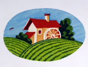
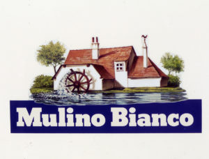
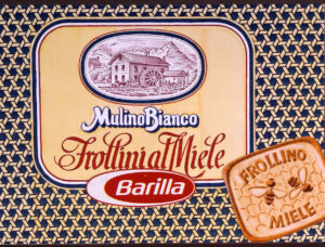
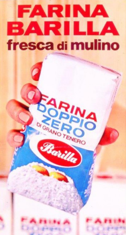
Though resorting to the biscuit making tradition of London had revealed itself to be a winning idea on the front of production, it was not so as far as for names and packaging: the consumers perceived foreign elements as distant and all of the proposals deriving from Anglo-Saxon, Danish or French languages were progressively discarded. The attention of Maestri, though, focused on one name: Moulin Blanc. It was just a matter of translating this in Italian to stay anchored to our rural history. “The name Mulino Bianco – he personally recalls – synthetizes the values of nature and tradition into the two concepts of genuineness and health: the Mill represents a simple way to make wheat products like once upon a time, and evokes nostalgia and a fantastic imaginary world; the psychological meanings of purity, strength and light are attributes of the word Bianco (the colour white)”. Moreover, a precedent case already existed in history of the Company, almost as a foreshadowing of things: ad advertising poster of the 1967 for Barilla white flour with the “Fresh from the Mill” payoff.
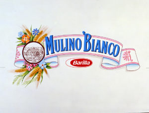
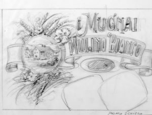
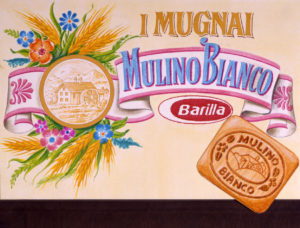
Thus, another figure who was decisive for the success of the brand emerged: Giò Rossi, who worked to the creation of logo and packaging in an effective team work with Maestri and Mambelli. He was a well known collaborator of the Company for over a decade: he designed the first jars of sauces, followed the restyling of the Oven Baked line of products, and the image of tortellini bags…
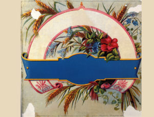
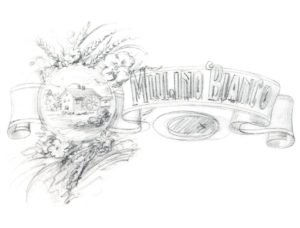
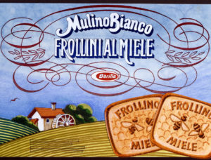
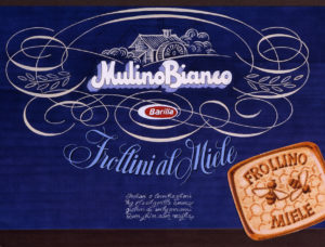
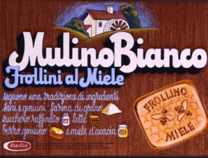
During an interview he recalled: “For the logo I used old catalogs dating before World War I: someone from 1915 and 1923, others of the Universal Expo of Paris of 1925… I had to trace on paper elements capable to suggest to the memory the smell and fragrance of idealized happy moments. From the sense of nostalgia of the harvest, the bunch of wheat surrounded by flowers of the fields was born. The subdued pastel colours were supposed to recall of the pink and light blue nuance used in the old chromolithography prints to highlight the skin tones and features of faces. Therefore, I asked Cesare Trolli to assist me, as he had a lifelong experience as chromolithographer and designer of cookies packages: he was the one who physically drew the first Mulino Bianco brand logo”. The mental process that lead to the choice of yellow as basic colour for the packaging was peculiar as well: “I wanted it to suggest tenderness. Tenderness is something you seek in childhood: the colour of milky flour, of cookie dough you stole from Mom before she baked them, or of eggnog. It had to be the colour of a rich, generous substance involving sentiments. Thus, I modelled it on two of my chromatic memories from childhood: one was white chocolate, the other a vitamin syrup of that colour and that I found very tasty. I always hoped to feel ill so that the doctor would prescribe it to me. So that yellow nuance was created – however it was theorized differently by someone else later on – and still today it is a distinctive feature of Mulino Bianco products”.
