France, Twenties

A fanciful stand of the Twenties in France.
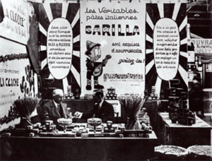
The most original, and from many points of view Disney-style inspired Barilla stand, of which we don’t know the author, is the one that was presented in France, around the half of the Twenties during a fair that, unfortunately, have not been identified.
Barilla that since 1908 was able to keep continuously in touch with foreign countries, with its own exports office, during the second decade of the century created advertising catalogues and postcards with the text written in French to prove the existence of a careful attention to the transalpine market.
This peculiar stand, included in a box delimited by three fixed walls and by a side that was open towards the expositional path, aligned in a dense sequence, a series of huge posters illustrating the multiple qualities of Barilla pasta. On the background of the central wall there was the Company brand represented by the most famous affiches – the young boy that spills the egg in the cupboard full of flour and the flying cook with the silver dish with a box of pasta on it – But the scene in its elaborated composition, presented an uncommon animation. As the picture documents it, one of the signs was hold by a clown, while a nanny was transporting a baby carriage full of pasta.
The Barilla sign, separated from the wall on the background, reminds of the bright screen of the Parisian shows of Moulin rouge or of the Folies Bergères, located to crown an expressionist scene that seems cut by the photogram of a movie of the époque.
At the center of the wall on the right, the most interesting one – there were two flashy posters that reproduced a radiant sun, which described, in an easy French, the qualities of Barilla pasta. In the one on the left bearing the inscription: “As this pasta is manufactured with the semolina from the best wheats of Russia, it represents one of the most nutritious and healthy food, even though it is cheap”. In the other, the continuation of the first tagline: “its taste is delicious and during the cooking its volume increases so that it’s sufficient to use one third less than the ordinary pasta”.
A huge central poster went with the double and pertinent “astrologic” recall. In its advertising imperative text, it reminded the visitors: “The true Barilla Italian pasta is excellent and nutritious, taste it!”
A further advertising support was represented by the musical strophe that sounded familiar.
As in an animation movie, the notes went out from the mandolin of a young shepherd, who carefully observed the lines of the pentagram for pulling out the chords that payed tribute to Barilla pasta.
All these images take back in time and show a taste and a style typically Transalpine, pleasant and in the same time evocative for creativity and advertising efficiency.