1926-1932 – The Baker’s Pocket Calendars

These calendars were printed by the Zafferri Brothers Printing Works, the company that together with Anonima Zafferri supplied the labels and boxes for packaging pasta. They held a monopoly on the Barilla advertising production for over a decade, and were among the first ones to introduce the process of four-color printing in Italy. Regarding the fact that the authors of the drawing sketches are unknown, it is possible that they were collaborators of the same typography, and perhaps these were the works of the artistic director Pietro Ambrosioni, who is indicated by oral sources as being very active as a graphic designer.
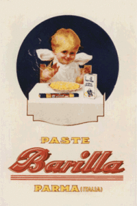
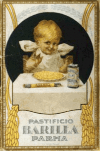
New characters related to real life and caught while eating a meal were introduced onto the scene. A blonde young boy standing in front of a piping hot dish of “angel hair” pasta looking merry and with puffy cheeks, in particular, advertises the gluten pasta, a flagship product of the Company, packaged for a wealthy middle-class market which was not affected by food rationing restrictions and regulated prices.
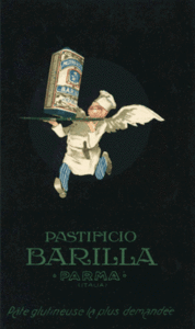
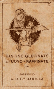
But the main actor of the advertising machine of that period was the dynamic and imaginative flying chef who had already appeared on the scene around 1925.
The character is a chef named Ermes (the Greek god Hermes) and likewise the prompt bearer of divine messages, he dispensed superior quality products. A zealous and ironically surreal character, it aimed at establishing a relationship of playful complicity with the receivers of the message. After all, it was a “tòpos” (archetype, model) of advertising of the period to make use of cross-reference images to the world of flight – both taken from mythology and other sources – from Mercury to Icarus, to the many Winged Victories of the commemorative monuments, to the exaltation of the dynamism of airplanes within Futurism.
In those years the myth of flight identified itself with the conquest of the element of air on the part of the pioneers of the aeronautical field. The raids and flights across the Atlantic, from D’Annunzio’s to Balbo’s, were events capable to catalyze the national interest.
Other great billboard designers, in particular Cappiello and Dudovich, used flight as a subject theme for pasta advertising. In 1921 Leonetto Cappiello created one of his “tourbillionantes” figures, expressing “joyeusitée” (joyfulness) for the “Pâtes Baroni” pasta: this character was able to identify itself with the product, likewise the red elf of the Campari aperitif, the green flaming devil of Thermogéne (medicated wadding), the Icarus character striding a zebra of Cinzano (liquor brand), and the young lady who flies out of a box of Cirio (tomato sauce), which were among the most famous creations of the artist from Livorno.
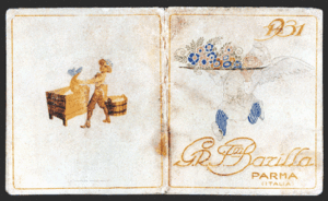
The winged chef of Barilla supplanted the previous character of the shop boy and performed the function of brand character for the gluten pasta. Indeed, it seemed to jump out of a round medallion (1930) that in addition to representing as a metaphor the terrestrial globe, could be seen as the paraphrase of the contours of a logo. Moreover, in those years the association of ideas of a flying chef and a shop worker was the ideal cover for the pocket calendars.
We know four different versions of these, among which the one dated 1926 which presents the two figures still connected in a symbiotic relationship with stalks of wheat. In another edition of 1931 the two subjects were isolated and cleaned from other decorative themes, and were strengthened with greater ability of synthesis in communication.
Indeed, with a gentle metaphor about flowers, the chef, in place of pasta, triumphantly holds a bouquet of multicolored flowers on a plate: these are non other than the signature mark left by Adolfo Busi in the wall calendar of that same year.
In 1932 the pocket size lunar calendar opens with the image of the child sitting at the table, while the chef adorns the back cover. The “putén” (child in Parma dialect), was diffused also through the postcards made in different versions, and aided the progressive transformation of the graphic design of text to shift towards a rounder typeface and the relevant aesthetics of the Twentieth century.
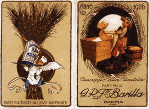
Year 1926. G. R. F.lli Barilla Pasta Factory. Pocket Calendar. Parma, F.lli Zafferri, 1925. ASB, Rlb 5; Almanac of 1930. G. R. F.lli Barilla Pasta Factory. Pocket calendar. Parma, F.lli Zafferri, 1929. ASB, Rlb 6; G. R. F.lli Barilla 1930. Pocket Calendar. Parma, F.lli Zafferri, 1931. ASB, Rlb 16; Barilla Pasta Factory Parma, 1932. Pocket Calendar. Parma, F.lli Zafferri, 1931. ASB, Rla 7.